
Check out our expert guide to help you find paint colours to enhance your interior
Most people realise that the right colour scheme can make or break any room in their home. So it’s absolutely essential to think hard about the palette you choose for your walls (and floors). We are known for our extensive range of luxury tiles – both interior and exterior – which are available in a huge range of colours, sizes and patterns. After all, the clue is in our company name! But did you know we also offer a premium paint portfolio too?
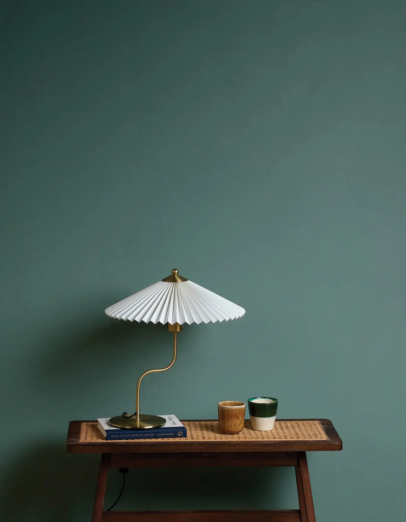
Deep and meaningful: Ander’s Rock is a restful and relaxing Ca' Pietra Proper Good Paint™ shade that’s available in an eggshell or matt emulsion finish
Our Ca’ Pietra Proper Good Paint™ collection is exactly that: a range of high-quality paint colours that’s easy to apply and delivers long-lasting results. The collection incorporates everything from standard base coats to specialty finishes. And because its UV-resistant, fade-resistant and water-repellent, it performs as good as it looks. Our team has worked hard to curate a variety of colours, from all ends of the spectrum, each of which is named after something (or someone) who’s inspired us on our journey. So there’s certainly no shortage of shades to select. But with so many different options available, how do you choose the right paint colours for your home? Read on to discover our expert recommendations.
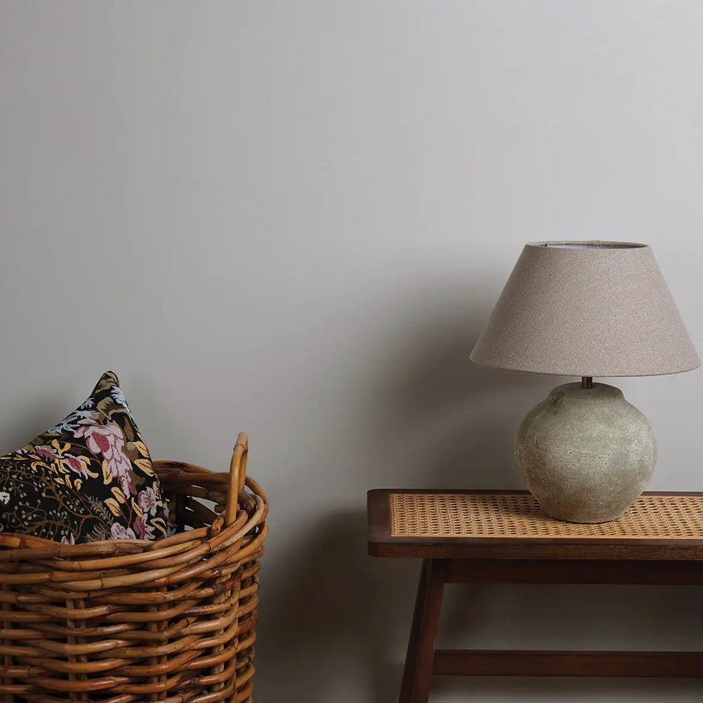
Searching for a subtle, understated shade of grey? Charlotte’s Whisper is one of our Ca' Pietra Proper Good Paint™ collection’s best-sellers, offering a timeless alternative to plain white walls
The feel-good factor
The right paint colours don’t just look pretty. They can actually affect the way we feel. There’s no shortage of evidence to corroborate the link between colour and wellbeing. Colour can influence our moods, our feelings – and even our physical health. Similarly, it can impact the ambience of a room more than any other factor. So bear in mind that the paint colours you choose can make a space feel relaxing or rejuvenating, energising or enervating. In other words, a room’s intended function is really important.
With so much at stake, it’s easy to understand why many of our customers worry about choosing the right (or wrong!) paint colours. Our advice? Be honest about the colours you like. Don’t be a slave to trends. And don’t pick paint colours you think you “should” like. Colour is a personal choice, so start with the shades that really resonate with you.
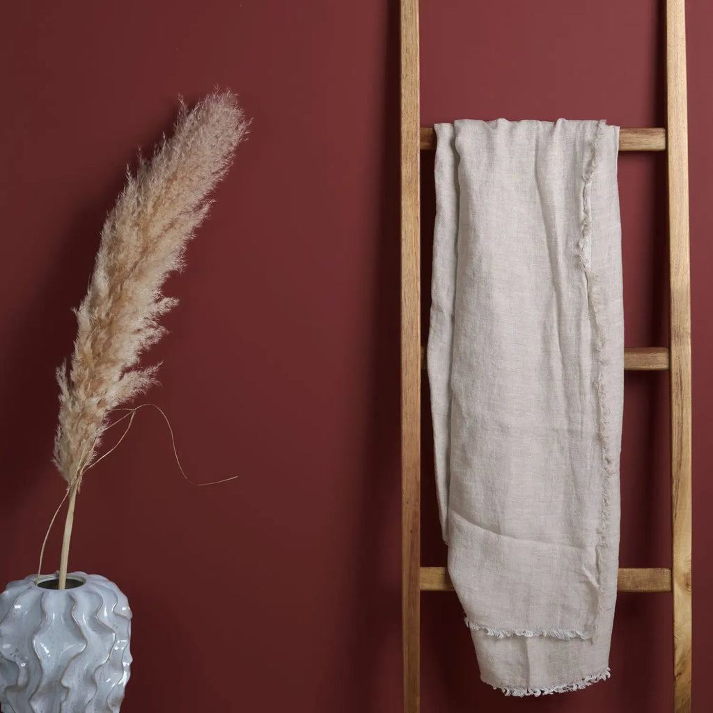
Rich and fruity: Our Ca' Pietra Proper Good Paint™ collection's Asher's Cranberry features a deep red which will add a classic touch to any home
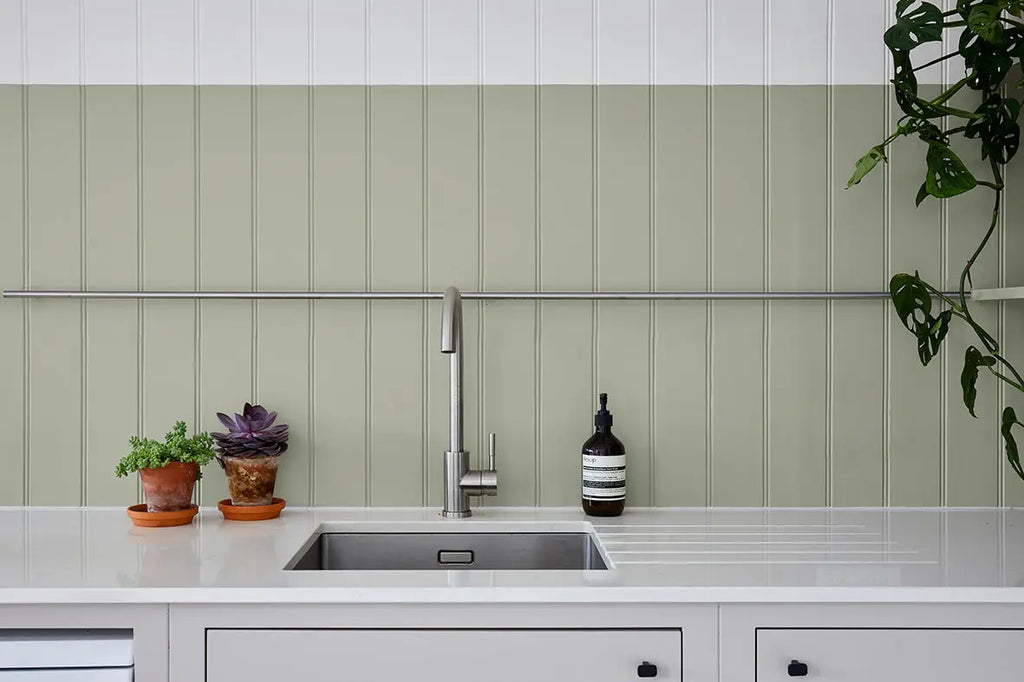
Nice and neutral paint colours
If you’re nervous about strong shades, a modern neutral palette could be the solution. Beige offers plenty of benefits, and actually incorporates a wide array of tones, from cream to tan or brown. Neutral paint colours suit both classic and contemporary room schemes. They are very conducive to steady concentration levels, so are ideal for studies, home offices, or simply rooms where you enjoy feeling quiet and undisturbed.
Soft and delicate, our Ca' Pietra Proper Good Paint™ collection’s Amara’s Slipper shade is an endlessly versatile neutral that’s perfect for any calm, soothing room scheme
Pastel picks
If you’re new to decorating with colour – but want to evolve away from white – consider pastel paint shades. Delicate powder blue, pale pink or mint green are an excellent choice for rooms where you want a wash of colour that won’t overpower. Pastels are perennially popular for bedrooms, but can be used to add softness to virtually any space, including modern sitting rooms or dining areas. Pastel paint colours are also a great way to add a pop of colour to a bathroom or cloakroom, via a sink or painted vanity. Pair with darker shades for depth or drama, or introduce contrast with a feature wall.
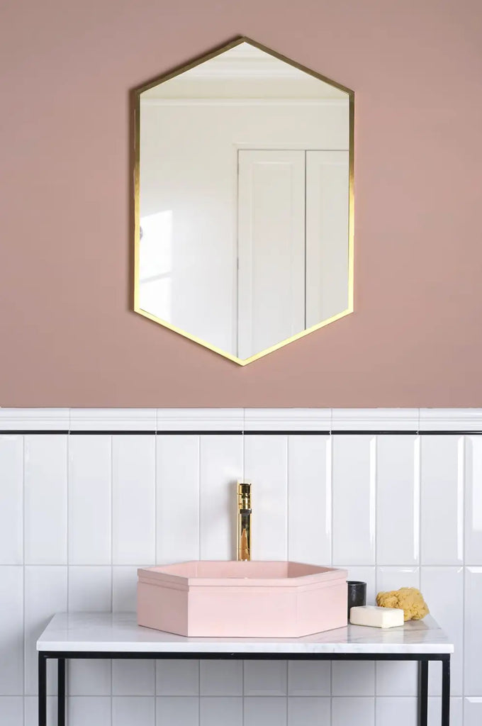
Our Ca' Pietra Proper Good Paint™ collection’s Ophelia’s Blush shade is a pretty, delicate dusky pink that’s ideal for adding an on-trend blush tone to bathrooms and bedrooms
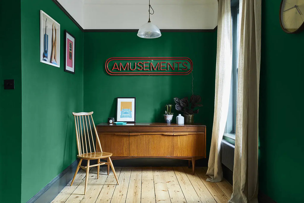
Embracing the dark side
Light, bright paint colours are a great way to open up smaller spaces to make them look bigger. Conversely, dark colours can make a room seem smaller, because they absorb, as opposed to reflect, the available light. But that doesn’t mean that darker paint colours should automatically be avoided – or that they are always gloomy and depressing. Used intelligently, a dark palette can create a striking room scheme that really elevates your interiors, and evokes a luxury ambience.
Go green with our Ca' Pietra Savannah’s Moss, one of the richest, deepest emerald shades of our Ca’ Pietra Proper Good Paint™ collection. Make a style statement with a feature wall, or use it as an accent colour
First and foremost, dark paint colours don’t begin and end with black and grey. Forest green, ruby red and chocolate brown, for instance, are all rich, interesting shades that can be used separately or in different combinations, according to the size, proportions and function of the room in question.
Unlike too much white, dark colours can really warm up a big space, and make it feel more welcoming. But darker paint colours can work just as well in smaller spaces, if you get the balance right. For example, offset dark walls with a lighter ceiling, which will give the illusion of height. And/or pair darker walls with a lighter floor.
A brilliant partner for both muted neutrals and brighter pops of colour, our Ca' Pietra Birdie’s Grey Proper Good Paint™ shade complements all types of interiors, from period properties to modern new-builds
Try paint colours before you buy
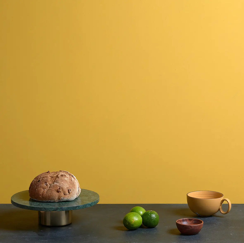
If you're looking for an opulent finish in your home, our Ca' Pietra Otto's Gold is a Proper Good Paint™ in a rich, classic, bold yellow for a statement finish
Aside from personal preference and room function, there’s another element to consider before you make the final decision about paint colours for your home. Both natural and artificial lighting will affect how paint colours appear. Rooms that face north let in a cooler natural light – and generally less of it – so they can feel colder and darker to begin with. This can also make certain colours look flat and muted, so balance this with warmer paint shades. Rooms that face south enjoy stronger, clearer natural light. Counter this intensity with cooler shades.
Just like natural light, artificial lighting can change how colours look over the course of a day and evening. The solution? Swatching! Never rush your paint selection process. To see how paint colours will really look, paint your different sample choices directly onto your walls, and live with them for at least 48 hours. Alternatively, paint a large piece of poster board with your short-listed shade(s) and stick this to your walls instead.
Show off your style with our Ca' Pietra Audrey’s Peacock! This bold Proper Good Paint™ shade is striking blue green blend that delivers a different feel depending on the light
This sort of swatch testing will allow you to see how prospective paint colours change according to the quality and quantity of light the room receives. It also indicates how well they work with any existing furniture and upholstery, before you take the plunge and purchase.
Paint palette sorted? Click here for our expert advice on how to transform your outside space now summer has finally arrived.
Hyperiontiles.co.uk – Frequently Asked Questions (FAQ)
Should I use different colours for different rooms, or can I use the same colour throughout my home?
Both options can work. Using the same colour can create a cohesive flow, while different colours can define separate spaces. Shop from our range of Ca' Pietra Proper Good Paint to find the one that matches your interior design style.
Share:
Seven reasons why you should upgrade your floors with porcelain tiles
Your essential guide on how to choose marble tiles