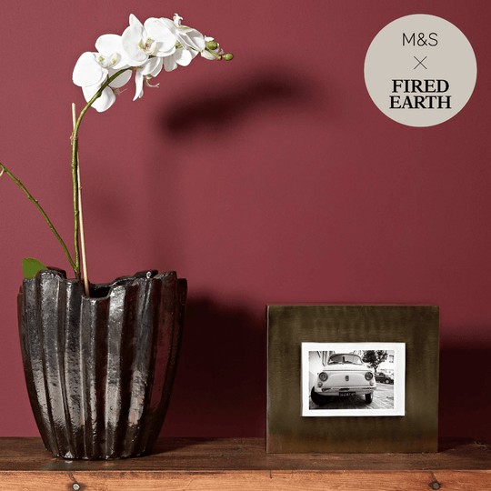
Red, Pink & Purple Paint
At Hyperion Tiles, our collection of red, pink and purple paint colours is designed to bring richness, emotion and personality into your home. These striking hues are full of depth and character, offering a powerful alternative to neutral shades and creating spaces that feel expressive, confident and entirely unique. Whether you’re drawn to the warm intensity of deep red, the softness of blush pink or the richness of violet tones, our carefully selected range of shades helps you add colour in a way that feels elegant, sophisticated and timeless.
Red, pink and purple tones are deeply rooted in design history. Red has long been associated with energy, luxury and warmth, while pink brings softness, femininity and subtle charm. Purple, in its many variations, offers a sense of depth and calm with an undertone of opulence. These colours have the power to shape the entire mood of a room — from bold and dramatic to romantic and restful. At Hyperion Tiles, our paints are thoughtfully curated to ensure these shades are not only beautiful in their own right, but also liveable and complementary with a wide range of materials, furnishings and lighting conditions.
Using Red Paint in the Home
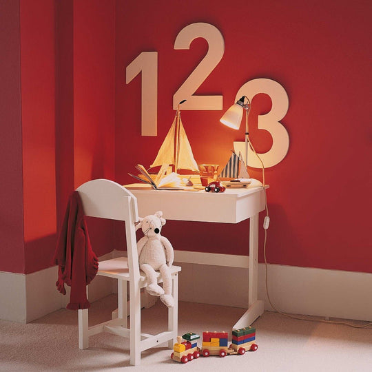
Red is a bold and emotive colour that can bring a sense of richness and drama to a space. It works especially well in rooms where warmth and atmosphere are important — such as dining rooms, lounges or cosy bedrooms. Deep reds such as oxblood, burgundy or claret create an enveloping, intimate mood that’s perfect for spaces used in the evening or for entertaining. These shades look especially beautiful under soft, warm lighting and pair well with darker wood tones, vintage furniture and metallic accents. Lighter reds and terracotta-based reds bring a Mediterranean warmth to a space, offering a grounded, earthy look that feels both rustic and refined.
While red is often considered a challenging colour to use, it becomes much more accessible when paired with the right textures and finishes. A single red wall in a well-lit room can provide a focal point that draws the eye without overpowering the space. In more traditional settings, rich reds work wonderfully alongside patterned wallpaper, antique brass and panelling, enhancing the period feel. At Hyperion Tiles, our red paint shades are carefully balanced to offer richness without harshness, allowing you to introduce drama in a way that feels confident and considered.
The Soft Versatility of Pink Paint
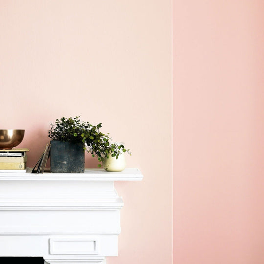
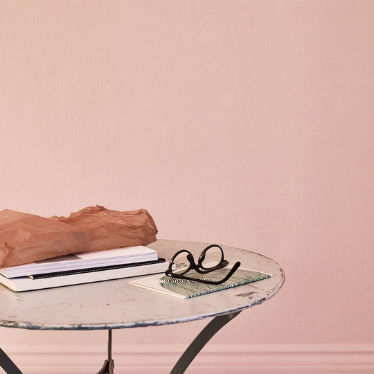
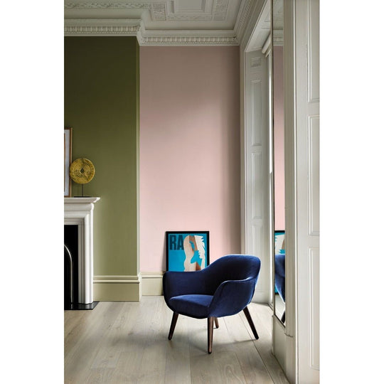
Pink paint has evolved far beyond its pastel or overly feminine stereotypes. Today’s pinks range from soft blush and muted rose to sophisticated coral and dusky mauve. These tones bring a quiet warmth and approachability to interiors, making them ideal for bedrooms, dressing rooms, living spaces and even kitchens. Lighter pinks, particularly those with grey or beige undertones, work beautifully as an alternative to cream or off-white. They add a soft, luminous quality to a room without feeling sugary or overly sweet.
In more grown-up interiors, pink paint can be layered with earthy tones, warm woods and natural textiles for a grounded, calming effect. Blush pink walls can create a serene bedroom setting when paired with linen bedding and aged brass accents. Stronger pinks, like coral or rose, can be used to create a warm and joyful focal point — either on a feature wall or within alcoves or cabinetry. Pink also combines well with both cool and warm colour palettes, offering real flexibility in how it’s used. At Hyperion Tiles, our range of pink paints reflects this versatility, offering shades that feel fresh and contemporary while still carrying the softness and ease that makes pink so appealing.
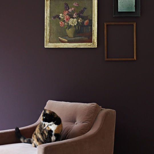
Embracing the Depth of Purple Paint
Purple paint has a luxurious and moody quality that makes it ideal for creating dramatic, layered interiors. Whether you prefer deep plum and aubergine tones or the softer feel of lavender and lilac, purple offers depth and atmosphere that works across both modern and traditional spaces. Dark purples can add richness to dining rooms, studies or lounges, especially when paired with dark wood, velvet upholstery and low lighting. These shades create a cocooning effect that makes a space feel intimate and expressive.
Softer purples such as heather or violet can feel calming and ethereal, working well in bedrooms, bathrooms or reading corners. They bring a unique sense of stillness and refinement, particularly when used with greys, silvers or pale neutrals. Purple also has the advantage of feeling both cool and warm depending on the undertone, making it incredibly versatile in various lighting conditions. At Hyperion Tiles, we’ve selected purple paints that are full of character but remain easy to live with, ensuring they provide elegance without overpowering your space.
Pairing Red, Pink and Purple Paint with Other Colours
Each of these colours works beautifully as a feature but can also be combined with others to create harmonious schemes. Red pairs well with warm neutrals, gold, dark wood and even deep green, offering a rich, layered palette. It also complements black and white in a more graphic setting. Pink, depending on the tone, pairs beautifully with sage green, soft grey, terracotta and muted blues. For a romantic palette, try combining blush with ivory and gold. For something bolder, coral pink with teal or navy makes for a fresh and contemporary scheme.
Purple shades work well with silver, brass, rich navy, charcoal and even soft greens. Pale lilac with creamy white creates a refined and classic look, while deeper plums work beautifully with bronze or dark green for a luxurious finish. These colours also respond well to natural materials such as linen, timber, marble and velvet, giving you even more ways to add texture and balance to your design. At Hyperion Tiles, we understand how important colour harmony is, which is why all of our paint shades are designed to complement a wide variety of palettes, ensuring you can achieve a balanced and cohesive interior.
How Light Affects Red, Pink and Purple Paint
Lighting plays a crucial role in how red, pink and purple paints appear in your home. Red shades can feel brighter and more vibrant in daylight, while becoming richer and more intimate under warm artificial light. This makes red ideal for spaces used in the evening or for entertaining. Pink paint, especially those with subtle undertones, shifts beautifully throughout the day — appearing cooler in natural light and warmer in the evenings. This makes it a flexible choice for bedrooms, hallways and multi-use living spaces.
Purple paint can appear dramatically different depending on lighting. In natural light, soft purples may feel airy and spacious, while deeper tones might feel more subdued. Under artificial lighting, dark purples gain a velvety richness, ideal for moody, luxurious spaces. As with any bold or complex colour, we always recommend sampling your chosen paint in the space before making a final decision. At Hyperion Tiles, we offer convenient sample pots so you can see how each shade looks at different times of day and in different corners of the room.
A Confident Choice for Personalised Interiors
Red, pink and purple paint colours are perfect for those looking to create a space that feels personal, expressive and unique. They offer a refreshing departure from the neutral tones often seen in modern interiors, allowing you to inject personality, warmth and emotion into your home. These colours can tell a story, evoke a feeling or completely transform the way a space is experienced — all through a well-chosen wall colour.
At Hyperion Tiles, we believe that colour is one of the most powerful tools in interior design. That’s why our collection of red, pink and purple paint shades has been curated to offer a wide range of tones — from subtle and soothing to bold and impactful. Every shade is made with premium pigments for lasting depth and quality, and our finishes are crafted for durability, beauty and ease of application.
Explore the Collection with Hyperion Tiles
Whether you’re planning a complete colour transformation or simply looking to add warmth to a single space, red, pink and purple paint can bring new life into your home. From dramatic dining rooms to soft and peaceful bedrooms, these shades have the power to shape your space in meaningful and lasting ways. At Hyperion Tiles, we’re here to help you choose the perfect shade with expert guidance, sample pots and a commitment to design-led quality. Explore our collection today and discover how colour can make your home truly yours.