Cream Paint & Neutral Paint
At Hyperion Tiles, our curated collection of cream and neutral paint colours has been designed to bring effortless elegance and calm to every space in your home. These soft, understated tones serve as the perfect backdrop to both contemporary and traditional interiors, offering a sense of warmth, balance and timeless style. Whether you’re transforming a compact flat, renovating a period property, or refreshing a single room, our cream and neutral paints deliver a clean, adaptable finish that works beautifully across all spaces. With subtle undertones and exceptional depth, each shade has been selected to support harmonious, long-lasting interiors.
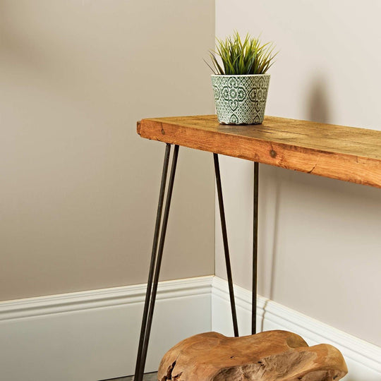
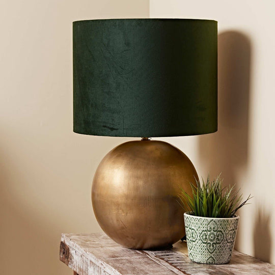
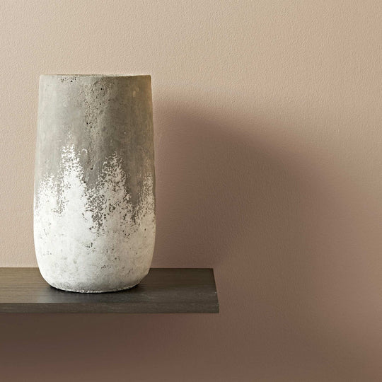
Cream and neutral paint colours are loved for their ability to create calm, cohesive schemes. These tones don't demand attention, yet they elevate a room by allowing natural light, texture and architectural features to shine. Cream brings a soft, warm glow that makes spaces feel welcoming and bright, even in low-light rooms. Meanwhile, neutrals such as pale taupe, warm grey or chalky stone offer a refined base that complements a wide range of colour palettes and materials. At Hyperion Tiles, we understand that subtlety often delivers the strongest impact — and our collection reflects that, offering versatile shades designed to evolve with your home.
The Appeal of Cream Paint
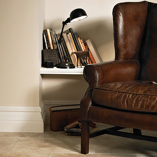
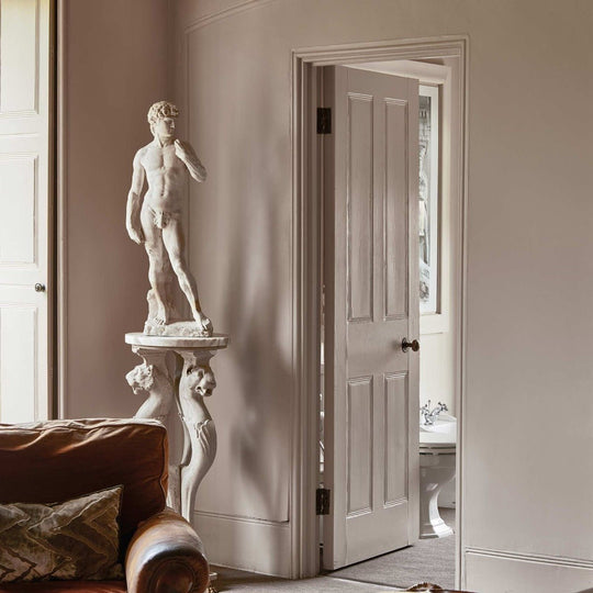
Cream paint is one of the most enduring choices in interior design. Its warmth and softness make it ideal for creating spaces that feel relaxed, elegant and well-proportioned. Cream works especially well in homes that need a gentle lift — particularly north-facing rooms or those with minimal natural light. Where brilliant white can sometimes feel stark or clinical, cream introduces a more inviting character. It creates a natural bridge between period features and more modern additions, making it a perfect option for renovations and mixed-style interiors.
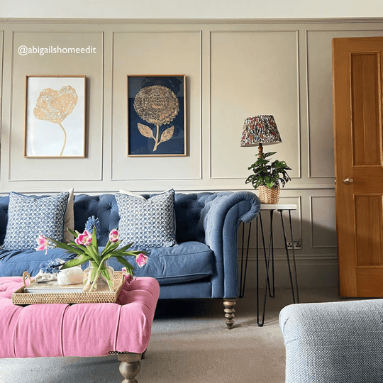
In a living room, cream paint helps establish a sense of calm and openness, pairing beautifully with timber floors, woven textures and neutral upholstery. It works equally well in kitchens, especially when used alongside natural materials like oak or stone. In bedrooms, it brings a serene quality that makes winding down at the end of the day feel effortless. Because it acts as such a versatile neutral, cream can also adapt with the seasons — fresh in summer, cosy in winter — making it an all-year-round choice for those who want consistency without compromise.
Neutral Paint Colours That Adapt to Your Style
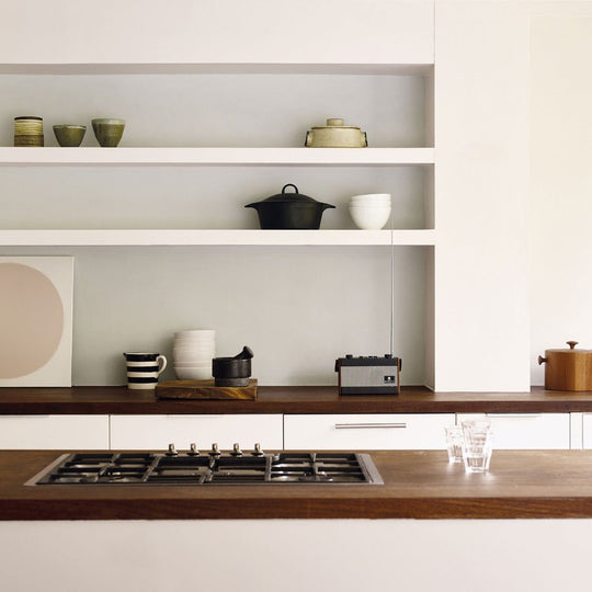
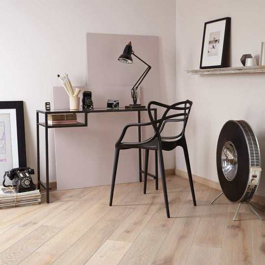
Neutral paint colours remain a favourite among interior designers and homeowners alike because they are so effortlessly adaptable. From soft greys and stone shades to subtle greige tones, these hues form the basis of calm, layered interiors. In modern homes, neutral paint offers a minimal backdrop that still has depth and interest. In traditional properties, it enhances character features while ensuring the space feels clean and updated.
These colours work particularly well in open-plan spaces or larger rooms where you want to maintain a sense of visual flow. By using a single neutral tone across walls, you can create cohesion from one area to the next without the need for bold contrast. Our neutral paints at Hyperion Tiles are carefully chosen to respond to natural and artificial light in a nuanced way, adding atmosphere without overwhelming the space. Whether your style is coastal, classic, contemporary or a blend of influences, these shades create room to express your individual taste through furnishings and decor.
Perfect for Every Room in the Home
Cream and neutral paints can be used in any room of the home to achieve different effects. In living rooms, they act as a grounding colour that allows you to layer in soft furnishings, artwork and statement lighting. For kitchens, off-white, taupe or warm grey tones create a light and airy backdrop, enhancing cabinetry in white, wood or even bolder tones like navy or green. These paint colours also reflect light well, making the room feel more spacious and fresh — a key consideration in kitchen design.
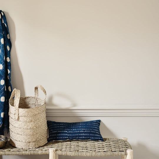
Bedrooms benefit from the calm, cocooning qualities of cream and neutral tones. Whether used on all walls or paired with darker shades on woodwork or panelling, these hues contribute to a restful and balanced atmosphere. In bathrooms, neutral tones give a spa-like feel when paired with natural stone, marble or brushed brass. They’re also a smart choice for hallways and entrance areas where you want to create a welcoming first impression and connect different parts of the home without jarring colour changes.
Pairing Cream and Neutral Paint with Other Shades
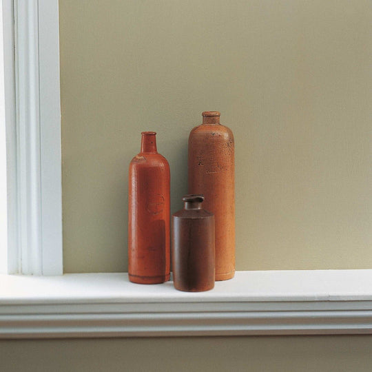
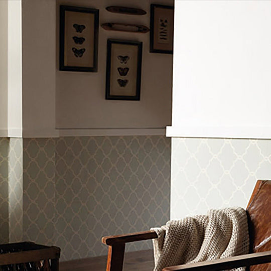
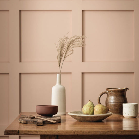
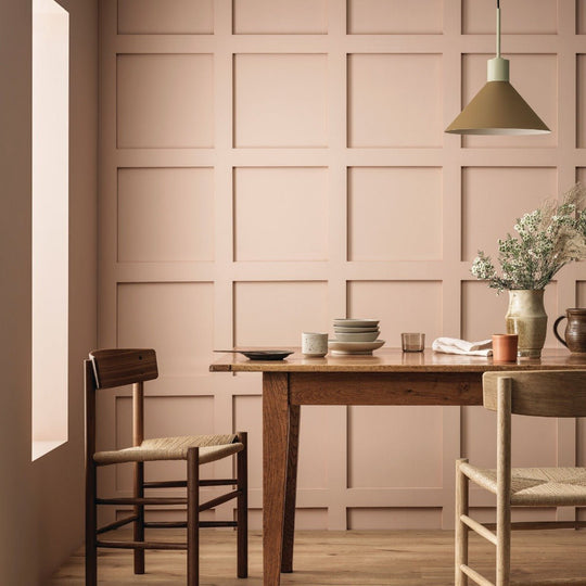
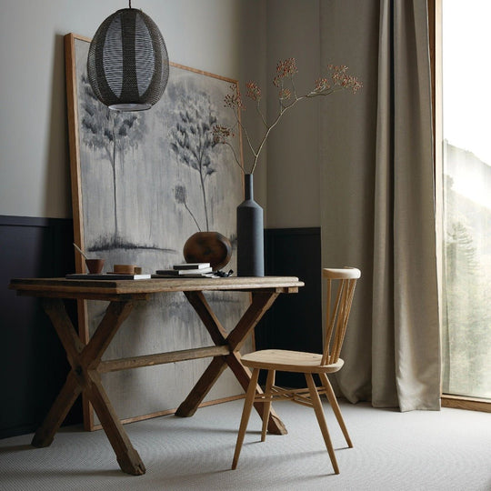
One of the greatest strengths of cream and neutral paint colours is their flexibility in colour pairing. These shades provide the ideal base for layering, whether you're adding contrast or building a tonal scheme. Cream pairs naturally with crisp white trims, soft green accents or muted blues for a gentle and classic combination. In contrast, taupes and greys can be paired with deeper colours like charcoal, navy or terracotta for a more modern and moody effect.
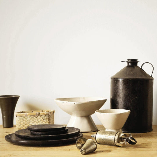
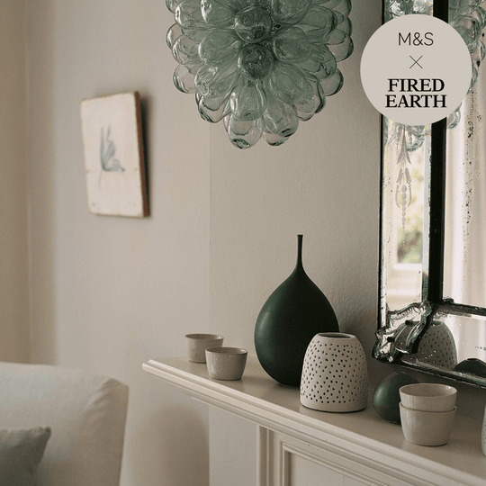
You can also create depth within a single room by using different shades from the same neutral palette. For example, walls in a pale greige paired with deeper warm grey woodwork can give subtle structure and elevate the entire space. Creams and neutrals are especially effective in showcasing texture — whether that’s through natural fabrics, timber furniture or handmade ceramics. At Hyperion Tiles, we understand that the right paint colour is often what ties an entire room together, and our collection is designed to give you that flexibility.
Lighting’s Role in Choosing the Right Shade
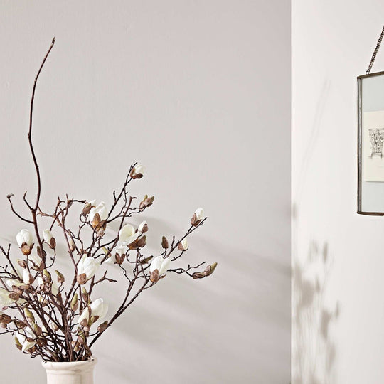
Lighting plays a crucial role in how cream and neutral tones appear in your home. These colours tend to shift subtly throughout the day depending on the direction of light, making them dynamic and layered rather than flat. In south-facing rooms, warmer neutrals will look brighter and more golden, while cooler-toned greys may take on a crisper appearance. In north-facing rooms, cream or neutrals with warm undertones help offset the cooler natural light and prevent the space from feeling too grey or shadowed.
Artificial lighting also affects how these paints are perceived. Soft white or warm lighting enhances the warmth of cream, making a room feel cosy and intimate in the evening. In contrast, daylight bulbs can bring out cooler elements in greys or taupes, which can be ideal in bathrooms or kitchens. At Hyperion Tiles, we always recommend trying out samples in your chosen space at different times of the day to get a true sense of how the colour will live in your home. Our 50ml tester pots make this simple and practical.
A Timeless Foundation for Evolving Interiors
Cream and neutral paint colours offer a reliable base that evolves beautifully with your interior style. If you like to update your furniture, soft furnishings or artwork regularly, these tones give you the freedom to make changes without needing to repaint each time. Their timeless nature also makes them a smart investment — they won’t date, and they complement almost every material, finish and trend you may bring into your home.
At Hyperion Tiles, we’re committed to helping our customers create beautiful, long-lasting interiors. Our paint collection is made to high standards, offering excellent coverage, lasting depth of colour and finishes that suit every room. Whether you’re working on a renovation, a new build or just refreshing one area, our cream and neutral shades provide the perfect starting point.
Find the Right Cream or Neutral Paint with Hyperion Tiles
Choosing the right neutral may come down to subtle shifts in undertone — a slightly cooler grey here, a touch more warmth there. That’s why we offer sample pots across our entire paint range, allowing you to test colours in real lighting conditions. Our team is also available to help guide you through the selection process, offering expert insight into pairing colours, choosing finishes and achieving the atmosphere you want to create.
Whether you’re looking for a soft ivory for your kitchen, a stone-toned grey for your hallway, or a warm cream for your bedroom, the Hyperion Tiles collection has something to suit every taste. Explore our paint range today and discover the enduring appeal of cream and neutral tones — made to enhance your home with quiet confidence and lasting style.