 BEAUTY IN EVERY DETAIL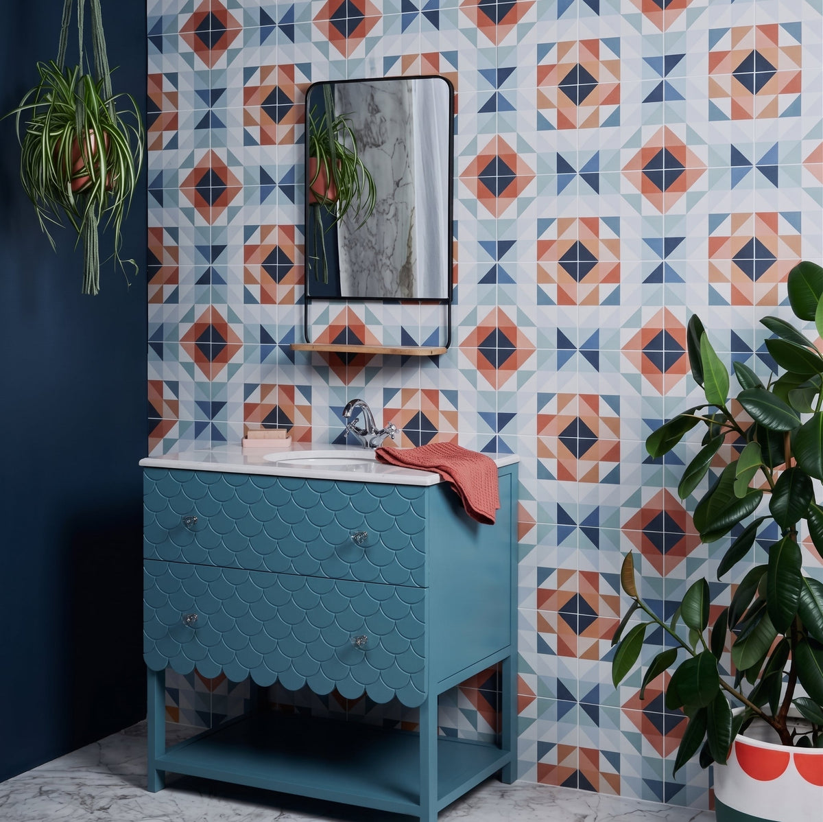
Mixing tile styles can elevate your interiors from mundane to magnificent. The most visually striking designs often emerge from playful experimentation — embracing unexpected combinations that truly reflect your personal style. Whether you're tackling a bathroom renovation, a kitchen refresh, or an entire open-plan living space, understanding a few key principles will help you mix tiles with confidence.

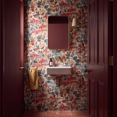
Our Ca' Pietra Sanderson Robin's Wood Madder tiles are crafted from porcelain and feature a matt decorative finish inspired by the beauty of nature. Their rich botanical pattern makes a beautiful statement when paired with simpler tiles, creating a layered and characterful scheme without overwhelming the space.
Key Points
- Follow the rule of three: Designate a dominant tile pattern (60%), a secondary pattern (30%), and a neutral accent (10%) to achieve visual balance across any space.
- Anchor with colour: Choose a consistent base colour or undertone across all your tiles — this creates harmony even when shapes and textures vary dramatically.
- Mix scales intentionally: Large-format tiles paired with smaller accent tiles create depth and visual interest without competing for attention.
- Contrast textures, not just colours: Combining matte and gloss finishes, or smooth and textured surfaces, adds sophistication and dimension to a scheme.
- Always sample first: Order physical samples and view them in your actual space at different times of day — tile colours and finishes can look very different under natural versus artificial light.
Understand the Basics of Tile Mixing

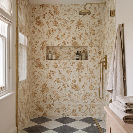
Our Ca' Pietra Sanderson Pillemont Toile Ochre Mural tiles are made from porcelain and feature a matt decorative finish. The intricate mural-style design brings warmth and personality to interiors, working particularly well alongside plain or subtly textured tiles to create a balanced look.
Mixing tile styles is an art form that transforms ordinary spaces into extraordinary design statements. Understanding the fundamental principles allows homeowners and designers to create visually compelling environments that feel intentional rather than accidental.
Proportion, Scale and Geometric Compatibility
Successful tile mixing is grounded in mathematical principles of symmetry and pattern coordination. Understanding geometric relationships is crucial when combining different tile patterns — the key is ensuring different tile shapes complement rather than compete with one another. Professional designers consider:
- Proportion: Maintaining visual balance between different tile sizes
- Scale: Coordinating tile dimensions to create depth and interest
- Geometric compatibility: Ensuring different tile shapes complement each other
Colour and Texture: The Essential Design Elements

Our Ca' Pietra Rialto Porcelain Blanc tiles provide the perfect neutral backdrop, pairing beautifully with our Ca' Pietra Rialto Porcelain Taupe tiles to allow more distinctive designs to take centre stage.
When exploring how to mix tile colours and styles, undertones and texture play pivotal roles. Design experts recommend focusing on cohesive colour palettes that create visual dialogue between different tile elements — this doesn't mean matching everything perfectly, but rather creating intentional contrasts that enhance overall design complexity. Professional designers typically employ techniques like:
- Selecting a consistent base colour across different tile styles
- Introducing complementary textures that add visual depth
- Using transitional tiles to bridge different design elements
Advanced Mixing Strategies for Distinctive Spaces
Advanced tile mixing goes beyond simple colour coordination. Tile design professionals suggest experimenting with unconventional combinations that challenge traditional design boundaries — mixing rectangular tiles with hexagonal patterns, or combining glossy and matte finishes to create multi-dimensional visual experiences. Consider these sophisticated approaches:
- Combining tiles of varying scales (large format with smaller accent tiles)
- Introducing geometric pattern variations within a neutral colour palette
- Creating visual narratives through strategic tile placement and zoning
Combine Colours, Textures, and Shapes Easily
Designing with tiles requires a nuanced understanding of how colours, textures, and shapes interact to create visually compelling spaces. Mastering the art of combining these design elements transforms ordinary surfaces into extraordinary statements that reflect personal style.
Strategic Colour Mixing Techniques

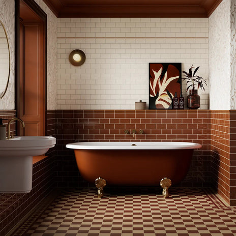
Our Windsor Osborne Caramel and Windsor Antique White tiles are crafted from ceramic and feature a beautiful glazed finish. Used together, their complementary colours demonstrate how mixing simple tile hues can create a classic, timeless look while adding depth and definition to walls.
Colour is the most powerful tool in tile design, capable of transforming spaces dramatically. Professional designers recommend creating a cohesive palette that tells a visual story — not by using identical colours, but by establishing a harmonious relationship between different tile hues. Effective colour mixing strategies include:
- Using a dominant base colour with accent tiles
- Creating gradual colour transitions across a space
- Introducing complementary colour families
- Balancing neutral tones with bold statement pieces
Texture and Shape: The Subtle Art of Tile Composition

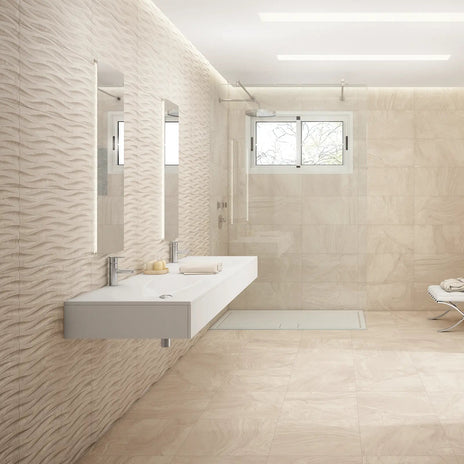
Our Waxman Ceramics Varana Almond and Varana Almond Deco tiles are made from porcelain and feature a matt finish. Pairing the plain and decorative versions creates an elegant way to introduce pattern without losing continuity, making them ideal for bathrooms and spaces where subtle zoning is desired.
Successful tile combinations depend on understanding geometric relationships. Professional designers approach texture and shape mixing as a sophisticated choreography of visual elements. Advanced techniques involve:
- Combining tiles of different scales (large format with smaller accent tiles)
- Mixing geometric shapes such as hexagonal and rectangular tiles
- Creating visual rhythm through strategic tile placement
- Balancing smooth and tactile surfaces for depth
The key to masterful tile design lies in creating a balanced visual narrative. Each tile should feel intentionally placed, contributing to an overall design that feels both cohesive and dynamic.
Mix Tiles for Different Areas

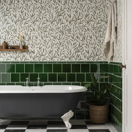
Our Original Style Arts & Crafts Willow tiles feature a decorative design inspired by traditional Arts and Crafts motifs, creating a beautifully detailed focal point. Pairing patterned tiles like these with quieter surfaces allows the decorative design to stand out while keeping the overall scheme harmonious.
Each area in your home presents unique design opportunities and challenges when mixing tiles. Understanding how to strategically select and combine tiles for different spaces ensures a cohesive yet distinctive aesthetic that enhances both functionality and visual appeal.
The Rule of Three: A Designer's Strategic Approach
Design experts recommend applying the "rule of three" when mixing tiles across various areas. This principle involves creating a deliberate hierarchy of tile patterns: a dominant pattern covering 60% of the area, a secondary pattern occupying 30%, and a solid colour tile completing the remaining 10%. This approach creates visual balance and natural flow between different spaces.
- Dominant Pattern: Choose a bold, statement tile for primary visual impact
- Secondary Pattern: Select a complementary design that adds depth without competing
- Solid Accent: Use neutral tiles to create visual breathing room
Area-Specific Tile Mixing Strategies

Our Original Style Arbour Lattice tiles bring geometric pattern and decorative detail to an interior. Their structured design can be paired with plain tiles or complementary patterns to create a considered, layered look that feels both classic and contemporary.
Tile laying patterns significantly influence a room's atmosphere, and different areas demand unique approaches to tile mixing:
- Kitchen: Combine durable, easy-to-clean tiles with visual interest — use decorative accent tiles for the backsplash, robust textured tiles for the floor, and coordinating neutral tiles at countertop transitions.
- Bathroom: Create spa-like environments by mixing textured and smooth tiles in the shower area, non-slip tiles with a complementary design on the floor, and geometric or patterned tiles on accent walls.
- Living Areas: Balance aesthetic appeal with practical considerations — statement tiles for fireplace surrounds, hard-wearing tiles with visual impact in entryways, and a consistent tile language across open-plan spaces.
Get Creative with Tile Examples

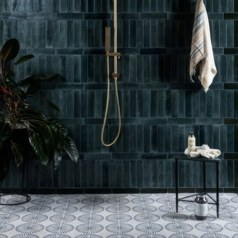
Our Ca' Pietra Cuba Porcelain Infantas Blue tiles are crafted from porcelain and feature a decorative finish with rich blue detailing. Their distinctive pattern works beautifully when mixed with simpler tiles, adding colour and personality while allowing surrounding surfaces to provide balance.
Creativity in tile design transcends traditional boundaries, transforming spaces into personalised artistic expressions. By exploring innovative approaches and challenging conventional design norms, you can create extraordinary visual narratives through strategic tile combinations.
Nature-Inspired Tile Innovations
Groundbreaking tile designs often draw inspiration from natural landscapes and organic patterns. By mimicking textures, colours, and geometric formations found in nature, designers craft truly unique arrangements. Creative nature-inspired approaches include:
- Organic Gradients: Transitioning tile colours like sunset or landscape palettes
- Geological Patterns: Replicating rock strata and mineral formations in stone-effect tiles
- Botanical Textures: Incorporating leaf-like veining and plant-inspired decorative designs
Unconventional Geometric Experiments
Innovative tile design emerges from exploring mathematical symmetries and unexpected pattern interactions. By challenging traditional grid systems, designers create visually dynamic spaces that engage and surprise. Experimental geometric strategies include:
- Breaking standard tile grid alignments for a more dynamic feel
- Introducing asymmetrical pattern placements as focal points
- Mixing scale and perspective within a single tile arrangement
Textural and Emotional Design Narratives
Truly creative tile design communicates emotional experiences through subtle variations in texture, shading, and composition — each tile becomes more than a surface covering, it transforms into a storytelling medium. Emotional design techniques involve:
- Creating tactile journeys through contrasting surface treatments
- Using tile arrangements to evoke specific moods or atmospheres
- Developing visual rhythms that guide visitors' perceptions through a space

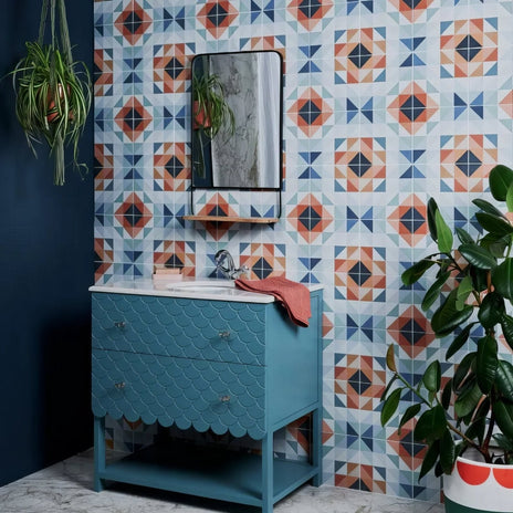
Our Ca' Pietra Kaleidoscope Porcelain Peacock tiles are made from porcelain and feature a striking decorative finish with an intricate geometric pattern. These statement tiles are perfect for adding a bold focal point, particularly when balanced with plain or more understated tiles elsewhere in the scheme.
Design Tip: When combining patterned and plain tiles, let the pattern lead. Choose your statement tile first, then select plain companions that pick out one of its secondary colours. This approach prevents the scheme from feeling random and gives it a considered, designer quality — even on a modest budget.
Tile Mixing Styles: Quick Comparison
| Style Combination | Best For | Finish Pairing | Difficulty |
|---|---|---|---|
| Patterned + Plain | Feature walls, alcoves, fireplaces | Matt patterned + matt or gloss plain | Beginner-friendly |
| Large Format + Small Accent | Open-plan floors, bathrooms | Consistent finish recommended | Beginner-friendly |
| Geometric + Neutral | Kitchens, cloakrooms, entryways | Matt geometric + gloss neutral | Intermediate |
| Matte + Gloss Mix | Wet rooms, shower enclosures | Same colour, contrasting finish | Intermediate |
| Botanical / Nature-Inspired + Plain Stone | Living rooms, statement bathrooms | Decorative matt + natural stone effect | Intermediate |
| Multi-Pattern (Rule of Three) | Whole-room schemes, open-plan areas | Shared colour thread across all tiles | Advanced |
Frequently Asked Questions
How do I start mixing tile styles?
Begin by understanding the basic principles of design — symmetry, proportion, and scale. Experiment with different colours, textures, and shapes to find combinations that resonate with your personal style, and always use physical samples in your own space before committing.
What is the rule of three in tile design?
The rule of three is a design principle that suggests using a dominant tile pattern (60%), a secondary pattern (30%), and a neutral accent (10%) to create visual balance and cohesion across different areas.
How do I choose colours for tile mixing?
Select a consistent colour palette that allows for intentional variations. Use a dominant base colour with accents and complementary tones to create a harmonious look. Picking out one of the secondary colours from your patterned tile as the shade for your plain tile is a reliable starting point.
How can I mix tiles in different areas of my home?
Different areas require unique tile mixing strategies. Combine durable tiles in the kitchen with decorative accents for the backsplash; in the bathroom, mix smooth and textured tiles to create a relaxing, spa-like atmosphere; and in living areas, use a statement tile as a focal point anchored by more restrained surfaces.
Transform Your Space with Confidence
Ready to mix tile styles like a pro? Embrace the art of combining colours, textures, and shapes — whether you're elevating your kitchen, creating a spa-like bathroom, or adding flair to your living spaces. Browse our extensive range of patterned tiles, porcelain tiles, and feature wall tiles at hyperiontiles.co.uk — and order your samples today.
Share:
What is Tile Layout? Guide to Floor & Wall Patterns 2025