
Patterned tiles are taking interior design by storm. In fact, over 50% of homeowners are now choosing decorative tiles for their renovation projects. But here’s the twist: many miss out on their true potential by sticking to traditional layouts. This means your patterned tiles could be hiding their dramatic beauty behind uninspired arrangements. Discover how to let your tiles truly shine and transform your space into an eye-catching masterpiece.
Table of Contents
- Choosing The Perfect Patterned Tile
- Designing Eye Catching Tile Layouts
- Mixing Patterns And Colours Smartly
- Finishing Touches For Cohesive Look
Quick Summary
| Takeaway | Explanation |
|---|---|
| Assess Your Space and Style | Evaluate the size and existing style of your space before selecting patterned tiles to ensure appropriate scale and coherence with your design narrative. |
| Utilise the Rule of Three | When mixing patterns, limit your palette to a dominant pattern, a secondary pattern, and a solid colour to create balance and avoid overwhelming your design. |
| Consider Grout Selection | Choose grout that either contrasts with or matches your tile to influence the visual emphasis of the pattern, and remember that grout width can impact the overall aesthetic. |
| Strategic Layout Design | Go beyond traditional layouts; consider herringbone, chevron, or basketweave arrangements to enhance visual interest and create a dynamic space. |
| Incorporate Thoughtful Finishing Touches | Balance the visual texture of patterned tiles with complementary fixtures, soft elements, and appropriate lighting to achieve a cohesive look. |
Choosing the Perfect Patterned Tile
Selecting the right patterned tile sets the foundation for how to style a patterned tile successfully. The perfect pattern not only complements your space but becomes a cornerstone of your design narrative. Let’s explore how to make this crucial decision with confidence.
Assessing Your Space and Style
Before diving into the vast world of patterns, take a moment to evaluate your space. The size of the area plays a significant role in pattern selection. Larger spaces can accommodate bold, dramatic patterns that might overwhelm smaller rooms. For compact areas like a powder room or small kitchen, consider smaller-scale patterns that create interest without dominating.
Your existing interior style should guide your pattern choice. In contemporary spaces, geometric patterns with clean lines create a sophisticated modern feel. Traditional homes often shine with classic motifs like damask or floral designs. For eclectic interiors, Moroccan or encaustic-inspired patterns can add that perfect bohemian touch.
Colour consideration is paramount. Choose patterns with hues that complement your existing colour scheme or serve as inspiration for a new palette. Remember that neutral-toned patterns tend to be more versatile and timeless, while vibrant colours make stronger statements that might require more thoughtful styling.
Understanding Pattern Scale and Repetition
The scale of a pattern dramatically impacts how it reads in a space. Large-scale patterns create drama and can make small spaces feel more expansive when used strategically. Small-scale patterns often read as texture from a distance, offering subtle interest that’s less likely to compete with other design elements.
Pattern repetition affects visual flow. Consider how often the pattern repeats and whether it creates a cohesive look across your installation area. Some patterns need precise alignment to maintain their design integrity, while others are more forgiving during installation.
“When selecting a patterned tile, always request several pieces to lay out on your floor before committing,” advises interior designer Claire Thompson. “This allows you to see how the pattern truly repeats and flows in your specific space.”
Practicality and Longevity Considerations
While aesthetics might drive your initial selection, practical matters deserve equal attention. Consider the following practical aspects:
- Maintenance requirements - More intricate patterns may hide dirt better but can be challenging to clean in detailed grooves
- Durability - Ensure the tile material suits your space’s traffic and usage patterns
- Trend longevity - Ask yourself if you’ll still appreciate the pattern in 5-10 years
Think about the longevity of your design choice. While some patterns are timeless (like classic checkerboards or hexagons), others might feel dated more quickly. If you’re concerned about longevity, consider using trend-forward patterns in spaces that are easier to renovate, like a small bathroom, rather than throughout an entire open-plan living area.
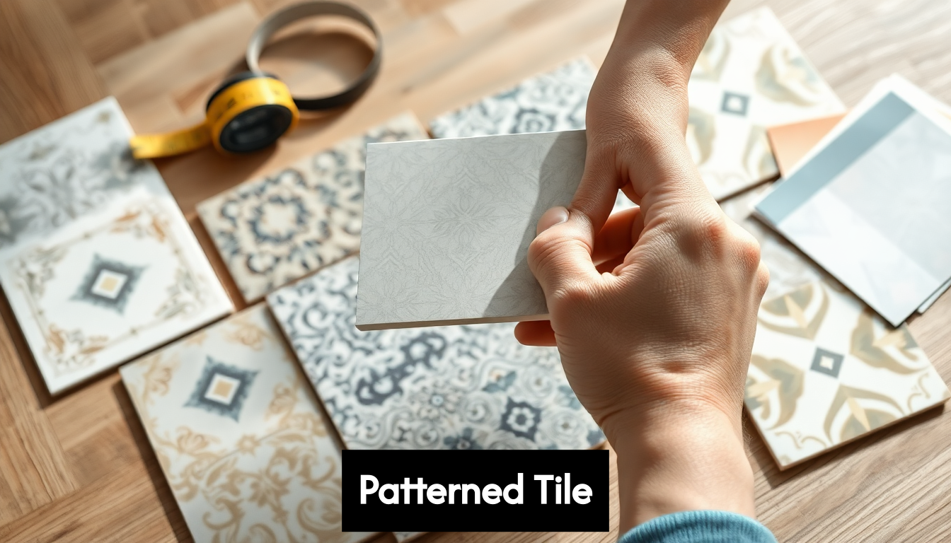
Sourcing and Sampling
Sourcing quality patterned tiles requires diligence. Visit tile showrooms where you can see and feel samples in person. Online retailers offer convenience but always request physical samples before committing to a large purchase. The way a pattern appears on screen often differs significantly from its real-life appearance, particularly regarding colour accuracy and texture.
Order enough sample tiles to lay out a section that shows how the pattern repeats. View these samples in your space at different times of day to understand how changing light affects the appearance. This essential step prevents costly disappointments after installation.
Many suppliers offer visualisation tools that let you see how patterns will look in a room setting. While helpful, these should supplement rather than replace physical sampling. Nothing compares to seeing the actual material in your specific lighting conditions.
Remember that choosing the perfect patterned tile isn’t just about finding a design you love—it’s about finding a pattern that enhances your space while meeting your practical needs. Take your time with this decision, as it forms the foundation for all the styling choices that follow.
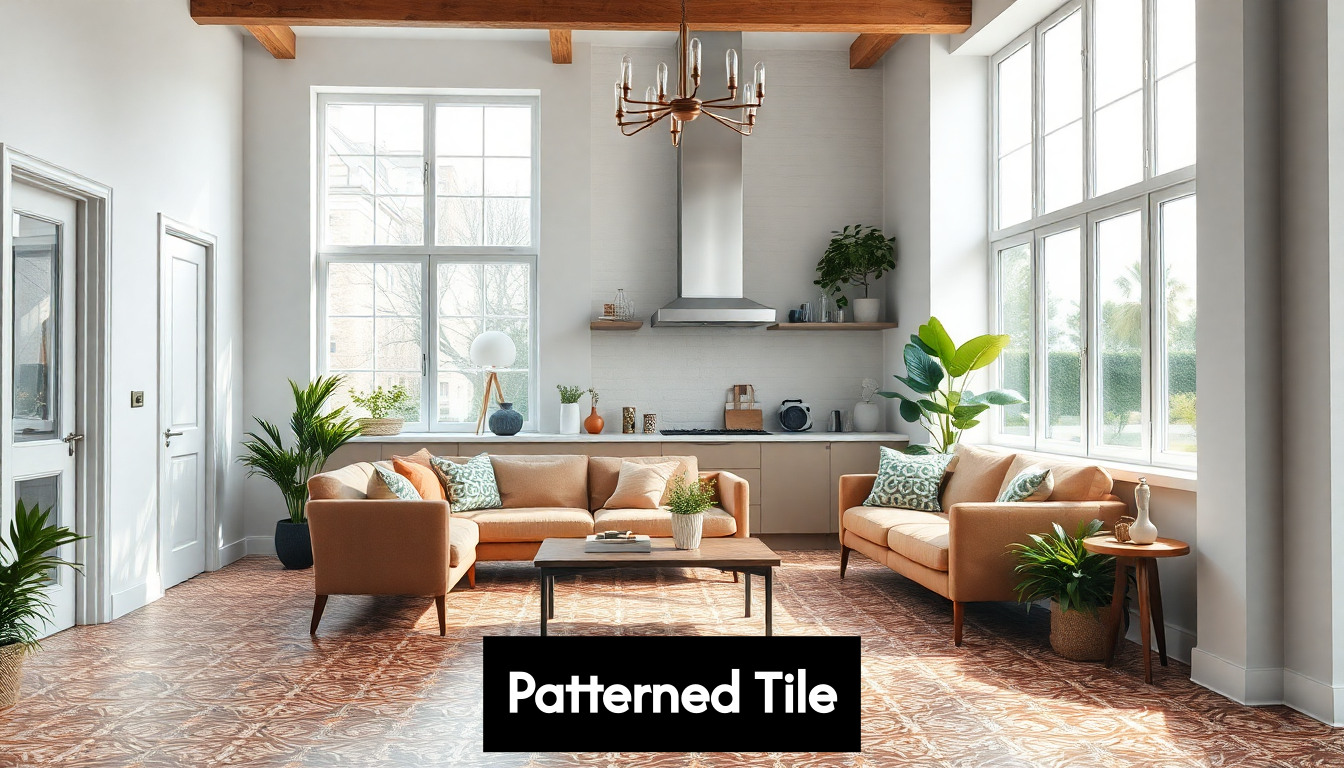
Designing Eye-Catching Tile Layouts
Once you’ve selected your perfect patterned tile, the next crucial step in how to style a patterned tile is determining the layout. The arrangement of your tiles can dramatically transform the visual impact of your space, creating different moods and optical effects depending on your approach.
Beyond Basic Grid Layouts
While the traditional grid layout (tiles aligned in straight rows and columns) remains popular for its simplicity and efficiency, patterned tiles offer opportunities for more creative arrangements. Consider these alternative approaches:
Herringbone patterns create dynamic movement and visual interest, particularly effective in long, narrow spaces like corridors where they draw the eye forward. This V-shaped arrangement works beautifully with rectangular tiles and can make small spaces appear larger.
Chevron layouts, though similar to herringbone, create a more pronounced zigzag effect with tiles cut at an angle. This bold pattern adds energy to a space and works wonderfully with solid-coloured tiles that let the arrangement itself become the pattern.
Basketweave arrangements evoke a sense of tradition and craftsmanship. This layout alternates pairs of rectangular tiles in a woven appearance, creating a timeless effect that complements both traditional and modern spaces.
“The layout you choose should enhance rather than compete with your patterned tile,” explains Amelia Wright, interior designer. “For intricate patterns, simpler layouts often let the design shine, while simpler patterns can be elevated through more complex arrangements.”
Strategic Placement and Focal Points
Thoughtful placement transforms patterned tiles from mere surface coverings to design statements. Creating a feature wall with patterned tiles in a bathroom or kitchen provides a stunning focal point without overwhelming the space. This approach is particularly effective with boldly patterned tiles that might be too intense for an entire room.
Tile borders offer another strategic option, framing a space or highlighting architectural features. A border of patterned tiles surrounding a plain field creates a rug-like effect on floors or a picture-frame effect on walls. This technique works particularly well in defining zones within open-plan spaces.
Consider creating a “rug” effect in large rooms by installing patterned tiles in a defined central area surrounded by coordinating solid tiles. This technique adds interest while maintaining balance and can significantly reduce your budget when using premium patterned tiles.
Playing with Scale and Perspective
The way you arrange tiles affects how we perceive space. Diagonal layouts make rooms appear larger by drawing the eye across the space, though they require more cutting and create more waste. This approach can be worth the extra effort in small bathrooms or narrow hallways.
Laying rectangular tiles in the direction of the longest wall emphasises a room’s length, while laying them perpendicular to the longest wall can make a narrow room feel wider. These simple orientation choices have remarkable effects on spatial perception.
For truly dramatic impact, experiment with gradient effects by gradually transitioning from patterned to solid tiles. This creates a fading effect that can be used to highlight certain areas or create visual flow between different spaces.
Technical Considerations
Beyond aesthetics, several technical factors affect your layout decisions. Pattern matching requires careful planning, especially with complex designs that need precise alignment. Always purchase extra tiles (at least 10-15% more than your calculated area) to account for cuts, breakage, and future repairs.
Start layout planning from the most visible point in the room. For floor tiles, this might be the entryway; for wall tiles, it might be the area directly opposite the door. This ensures that any awkward cuts or partial tiles end up in less noticeable areas.
Remember that more complex layouts generate more waste and require more installation time, affecting your budget. Discuss these factors with your tiler before finalising your design to ensure it’s practical within your constraints.
Visualising Before Committing
Before installation, take time to dry-lay your pattern. For floors, arrange tiles without adhesive to visualise the effect. For walls, modern design software or even simple graph paper sketches can help visualise the outcome.
Many professional tilers now offer digital mock-ups showing exactly how your chosen layout will look in your space. This service is particularly valuable when working with expensive patterned tiles or complex layouts.
Designing eye-catching tile layouts requires balancing creativity with practicality. By thoughtfully considering placement, arrangement, and technical factors, you’ll create a tile installation that showcases your patterned tiles to their best advantage while enhancing your overall space.
Mixing Patterns and Colours Smartly
Mastering how to style a patterned tile often involves the art of combination—bringing together different patterns and colours in harmonious ways. This approach creates spaces with depth, personality and visual interest that single-pattern installations rarely achieve. Let’s explore how to mix patterns and colours with confidence.
The Rule of Three
When combining multiple patterned tiles, the classic “rule of three” provides a reliable starting point. This principle suggests limiting your palette to three elements: typically a dominant pattern, a secondary pattern, and a solid colour that ties everything together. This creates visual variety without overwhelming the senses.
The dominant pattern should be your statement piece—the design that initially drew you in. Use this for approximately 60% of your tiled area. Your secondary pattern should occupy about 30%, while the remaining 10% can feature a solid colour that complements both patterns.
“The beauty of the rule of three is that it creates balance,” notes colour specialist Emma Parsons. “The eye needs visual resting places between patterns, which the solid elements provide, while the hierarchy between dominant and secondary patterns creates natural visual flow.”
Colour Cohesion Techniques
Successful pattern mixing relies heavily on colour cohesion. When selecting multiple patterns, identify a unifying colour that appears in each design. This common thread creates instant harmony even between dramatically different patterns. For example, a bold geometric tile and a delicate floral pattern can work beautifully together if both contain the same shade of blue.
Another effective approach is to work within a tightly defined colour family. Combining patterns that share the same colour palette but vary in intensity creates sophistication through subtle variation. For instance, pairing deep navy patterns with lighter blue designs creates depth while maintaining harmony.
Contrast creates drama. While cohesion is important, don’t shy away from strategic contrast. Black and white patterned tiles paired with a vibrant accent colour create striking, memorable spaces. This high-contrast approach works particularly well in spaces meant to energise, like kitchen backsplashes or shower feature walls.
Scale Variation for Visual Interest
When combining patterns, varying the scale prevents competition between designs. Pair large-scale patterns with smaller, more intricate ones to create visual hierarchy. This scale variation gives the eye natural places to rest and appreciate each pattern individually.
Consider the viewing distance as well. Patterns viewed from a distance, like floor tiles in a large room, can be more complex as they’ll read as texture from afar. Patterns viewed close-up, like a kitchen backsplash, might need more breathing room between different designs.
A practical approach is to use larger patterns for larger surfaces and smaller patterns for more contained areas. For example, a bold, large-scale pattern might work beautifully on a floor, while a more delicate, smaller-scale pattern could complement the walls or splashback.
Transitional Techniques
When using multiple patterns in adjoining spaces, thoughtful transitions create flow throughout your home. Consider these strategies for smooth visual connections:
- Use a border tile to create a deliberate boundary between different patterns
- Gradually blend from one pattern to another through a transition zone
- Connect spaces by repeating a colour from one room’s pattern in the next room’s solid elements
These transitional techniques are particularly important in open-plan spaces where different functional zones benefit from distinct patterning but need to feel cohesive as a whole.
Finding the Right Balance
Balance is crucial when mixing patterns. Think of it as a conversation—you want each pattern to have a voice without any single one dominating completely. If one pattern is particularly bold or busy, balance it with more restrained designs that complement rather than compete.
Consider the overall feel you want to achieve. For serene spaces like bedrooms or bathrooms, a subtler approach to pattern mixing creates sophistication without sacrificing tranquility. For energetic spaces like kitchens or playrooms, more dynamic combinations can create stimulating, lively environments.
Create mock-ups before committing. Arrange sample tiles together and live with them for a few days, observing how they interact in different lighting conditions. Often, combinations that seem perfect in theory need adjustment once you see them in your actual space.
Remember that white space—or its equivalent in solid-coloured tiles—provides crucial breathing room between patterns. These visual pauses allow each pattern to shine individually while contributing to the collective impact.
By approaching pattern and colour mixing methodically, you’ll create tile installations that express your personal style while maintaining design harmony. The most successful spaces often tell a cohesive story through apparently diverse elements, creating interiors that feel both thoughtfully designed and naturally evolved.
Finishing Touches for Cohesive Look

Once your patterned tiles are installed, the real magic of learning how to style a patterned tile begins. The finishing touches you select will either enhance your tile’s impact or diminish its effect. These final elements tie everything together, creating a cohesive space that feels thoughtfully designed rather than haphazardly assembled.
Grout Selection: The Unsung Hero
Grout might seem like a minor detail, but it profoundly impacts the final appearance of your tiled surface. For patterned tiles, grout selection requires particular attention. Contrast grout (a colour that differs significantly from your tile) emphasises the tile shape and installation pattern, making the layout more prominent than the pattern itself. This approach works well when you want to create additional visual interest with simpler patterns.
Matching grout (selecting a colour that blends with your tile) allows the pattern to take centre stage, creating a more seamless look where the tile design remains the focal point. For busy patterns, this often creates a more sophisticated finish.
Consider grout width carefully. Narrow grout lines create a more continuous surface, while wider grout lines emphasise the grid pattern. For most patterned tiles, thinner grout lines (1-2mm) allow the pattern to flow more naturally across the surface without interruption.
Remember that grout doesn’t just affect aesthetics—it’s also functional. In wet areas like bathrooms, consider epoxy grout for its superior water resistance and durability, even if it costs more initially.
Complementary Fixtures and Hardware
The fixtures and hardware you select should converse with your patterned tiles rather than compete with them. In bathrooms and kitchens, tap finishes, handles, and other metal elements should complement the colour tones in your patterned tiles.
For tiles with warm undertones (terracotta, gold, rust), brass or copper fixtures create harmony. For cooler-toned patterns (blues, greens, greys), chrome or nickel often works beautifully. When in doubt, matte black fixtures offer a contemporary option that pairs well with almost any tile pattern.
“The relationship between your tiles and fixtures should feel intentional,” explains interior stylist Rebecca Chen. “Pull a secondary colour from your patterned tile as inspiration for your fixture choice. This subtle connection creates sophistication through repetition.”
Textural Balance and Soft Elements
Patterned tiles add visual texture to a space, which needs balancing with actual texture from complementary elements. Consider these strategies:
- In kitchens with patterned backsplashes, incorporate wooden cutting boards, textured ceramics, or linen tea towels to add warmth
- In bathrooms, fluffy towels, natural woven baskets, or wooden bath mats create textural contrast with glossy tiles
- In living spaces with tiled floors, layer area rugs, particularly in solid colours that complement your tile palette
These soft elements not only balance the hardness of tile but also provide opportunities to pull colours from your patterned tile into the broader room design. A subtle motif from your tile can inspire textiles throughout the space, creating cohesion even when the connection isn’t immediately obvious.
Lighting to Enhance Your Tiles
Thoughtful lighting transforms how patterned tiles are perceived. Directional lighting (like wall sconces or adjustable spotlights) can emphasise texture and dimension in your tiles, particularly useful for subtle patterns or three-dimensional tile surfaces.
Under-cabinet lighting in kitchens illuminates backsplashes beautifully, while floor-level lighting in bathrooms can dramatically highlight patterned floor tiles. Consider how light interacts with your specific tile finish—glossy tiles reflect light and can appear to sparkle, while matte finishes absorb light and often show the pattern more consistently across different times of day.
Even your choice of light temperature affects how tile colours appear. Warmer light (2700-3000K) enhances reds, oranges and yellows in your pattern, while cooler light (3500-4000K) makes blues and greens more vibrant. For the most accurate colour representation, daylight-balanced lights (around 5000K) are ideal.
Art and Accessories: The Final Layer
The decorative elements you choose should complement rather than compete with your patterned tile. In spaces with bold tile patterns, consider more restrained art and accessories in solid colours pulled from your tile design. Conversely, if your tile pattern is subtle, you have more freedom with decorative elements.
Create thoughtful moments that draw attention to your beautiful tiles. A carefully placed plant that picks up a green tone from your pattern, or pottery that echoes a particular shape in your tile design, creates those subtle connections that make a space feel considered and complete.
Scale matters with accessories. In bathrooms with busy patterned tiles, fewer, larger accessories often look more elegant than numerous small items. This prevents the space from feeling cluttered and allows both the tiles and selected pieces to shine.
By attending to these finishing details, you transform a simple tile installation into a cohesive design statement. The most successful spaces feel inevitable—as though every element belongs precisely where it is, creating a harmonious whole greater than the sum of its parts.
Frequently Asked Questions
How do I choose the right patterned tile for my space?
Selecting the right patterned tile involves assessing the size and existing style of your space, considering the scale of the pattern, and ensuring it fits your design narrative. Aim for colours that complement your current palette and maintain practicality for longevity.
What are some creative layouts for patterned tiles?
Beyond the traditional grid layout, consider innovative arrangements such as herringbone, chevron, or basketweave patterns. These designs can enhance visual interest and dynamically alter the perception of space.
How can I mix different tile patterns effectively?
To mix patterns successfully, use the rule of three: a dominant pattern, a secondary pattern, and a solid colour. Ensure the patterns have a cohesive colour scheme and vary their scale for visual balance, creating a harmonious design.
What finishing touches should I consider for tiled areas?
For a cohesive look, choose grout that complements or contrasts with your tiles, and select fixtures that relate to the tile colours. Incorporate soft elements for textural balance, and use strategic lighting to enhance the tile’s features.
Unlock the Full Potential of Your Patterns with Hyperion Tiles
Are you ready to elevate your interior design with stunning patterned tiles but feeling overwhelmed by choices and layouts? You’re not alone! Many homeowners yearn for that perfect blend of functionality and flair, whether it’s creating that striking focal point in a small bathroom or mastering the art of pattern mixing. Thankfully, at Hyperion Tiles, we’ve got the tools to turn your vision into reality.
Explore our extensive catalogue featuring a wealth of bathroom, kitchen, and wall tiles specifically curated to meet your design aspirations. With promotions, trade discounts, and a customer-first approach—complete with price matching and free shipping on orders over a certain amount—we’re dedicated to making your purchasing experience as seamless as possible.
Visit Hyperion Tiles now and discover how easy it is to style your space. Don’t wait—your dream interior is just a click away! Start browsing today and transform your home into a stunning masterpiece!
Share:
Discover Popular Tile Patterns for Modern Home Style
What is Tile Layout? Guide to Floor & Wall Patterns 2025