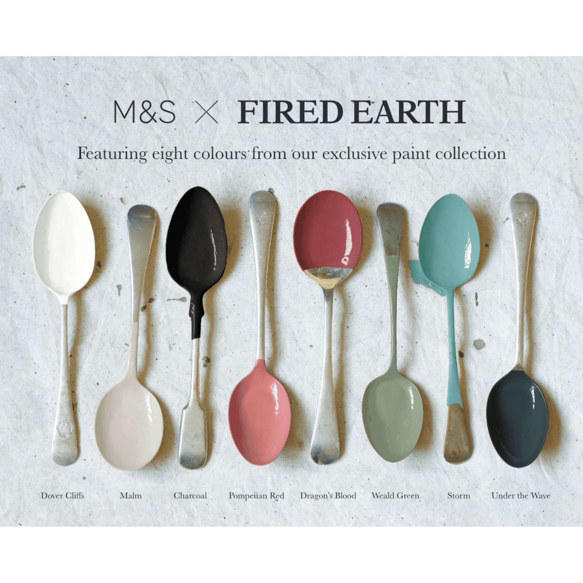
Statement Paint Hues
At Hyperion Tiles, we understand that sometimes your home needs more than soft neutrals or calming pastels. Sometimes, it calls for colour with personality. Our curated collection of statement paint hues is designed to make a lasting impression — bold, expressive, and full of character. From dramatic navy blues and vibrant greens to rich ochres and high-impact terracottas, statement shades inject life and individuality into a space. These colours have presence, depth and intensity, offering a dynamic alternative to more subdued palettes. Whether you’re designing a single feature wall or planning an entire room around a bold colour, our statement paints are made to elevate your interiors with confidence.
Statement paint hues are not about following trends. They’re about embracing creativity and designing a home that reflects your personality. A bold colour can shift the mood of a space entirely, adding energy, drama, sophistication or even a touch of playfulness. These tones create focal points, define zones in open-plan layouts and help highlight architectural features. At Hyperion Tiles, we believe that strong colour should be usable, liveable and inspiring. Our range includes shades that are rich in pigment, versatile in tone, and suitable for every room in the home — from standout living spaces to unexpected colour in quiet corners.
The Power of Colour in Interior Design
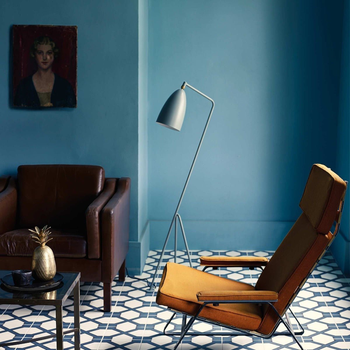
Colour has the ability to influence the mood and feeling of a room more than any other design element. While soft neutrals tend to soothe and unify, statement hues energise and engage. Deep shades such as petrol blue or forest green offer sophistication and warmth, while brighter colours like mustard, teal or coral bring vibrancy and a sense of fun. Statement colours are often associated with bolder interiors, but they can be just as effective in more minimalist spaces where a single colour takes centre stage. Whether layered with texture or allowed to shine on its own, a strong colour choice can elevate the entire design scheme.
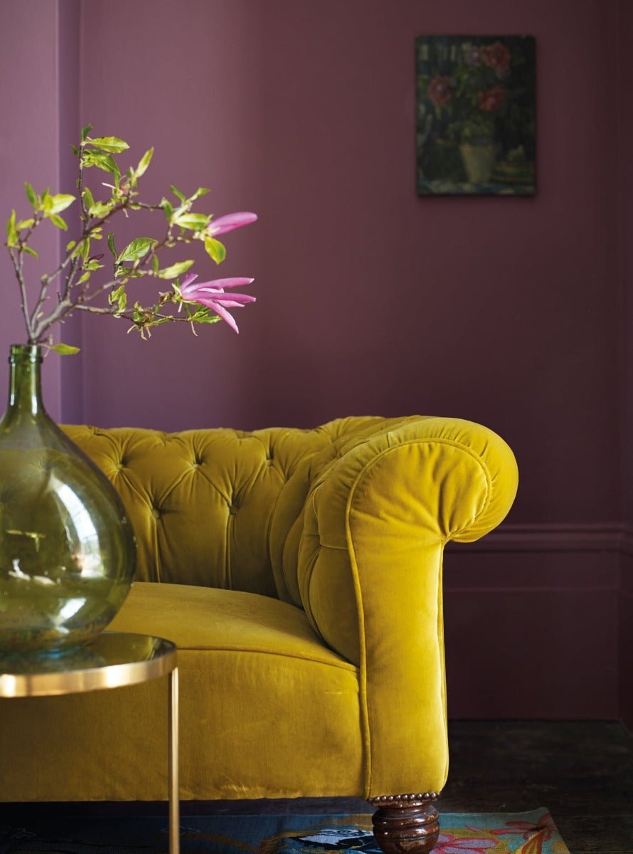
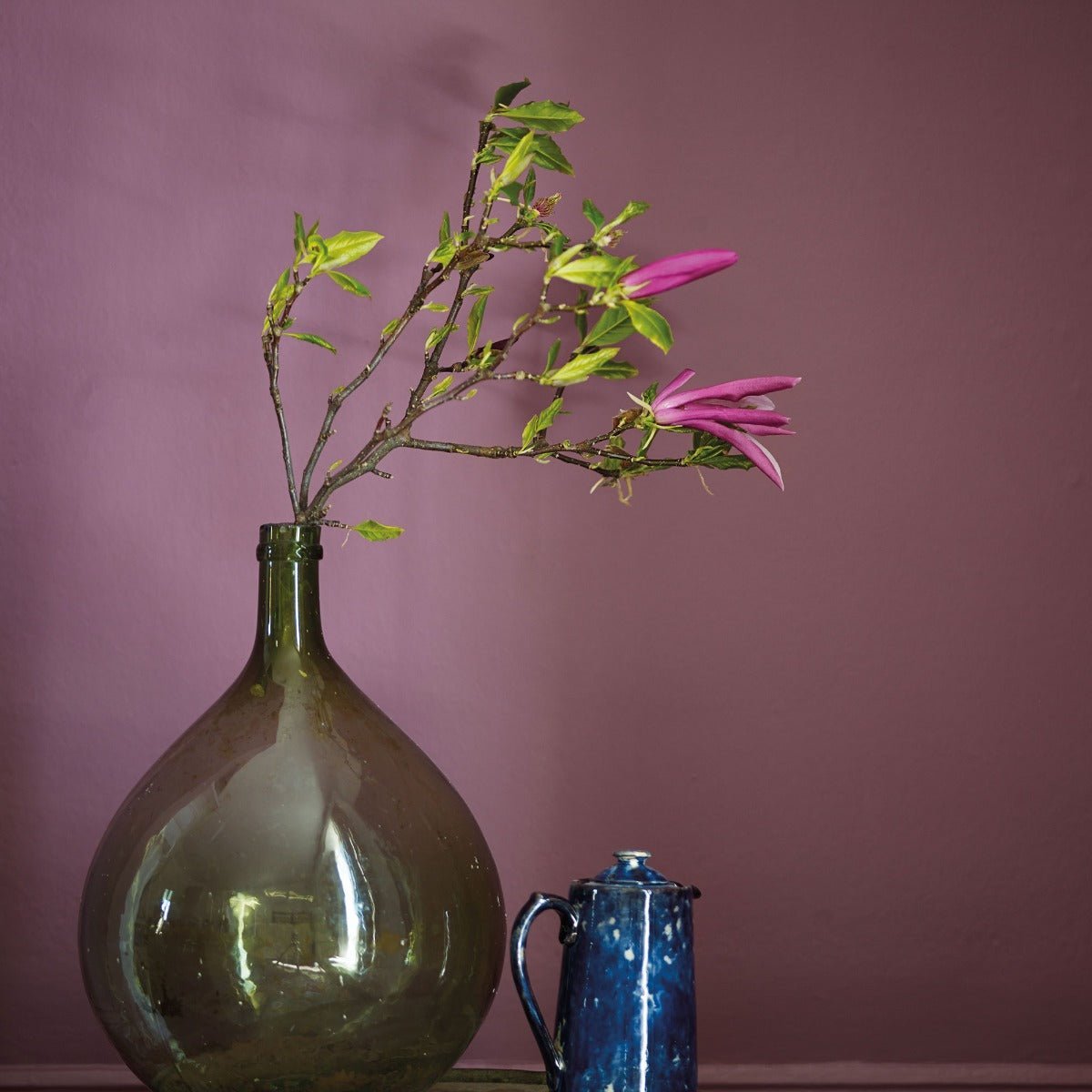
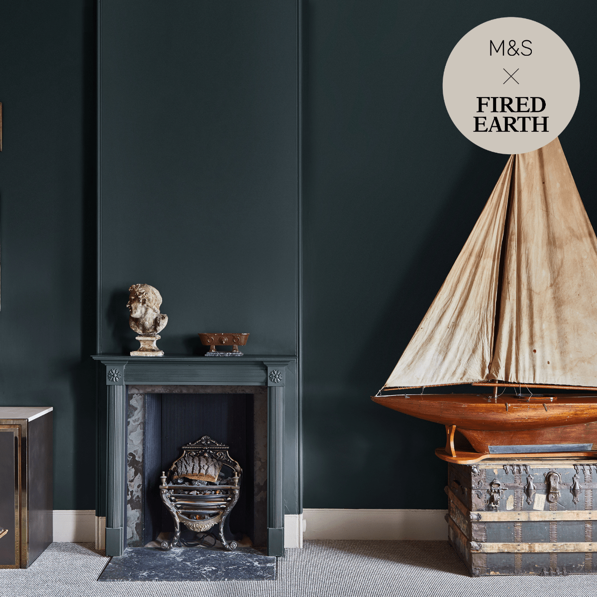
Statement paint also provides an opportunity to create contrast and depth. Pairing a rich wall colour with paler woodwork or neutral flooring draws the eye and helps zone different parts of a room. You might use a bold tone to frame a fireplace, highlight built-in joinery, or enhance the atmosphere in a dining room or snug. In homes with high ceilings or period features, strong colour can emphasise proportions and detail. In more contemporary spaces, it offers a way to introduce personality and warmth into clean-lined architecture.
Where to Use Statement Paint Hues
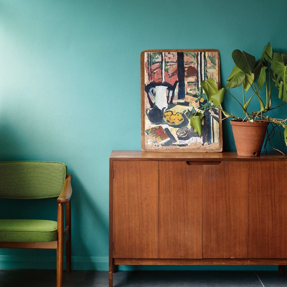
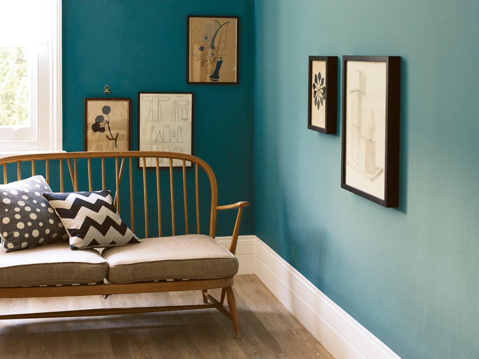
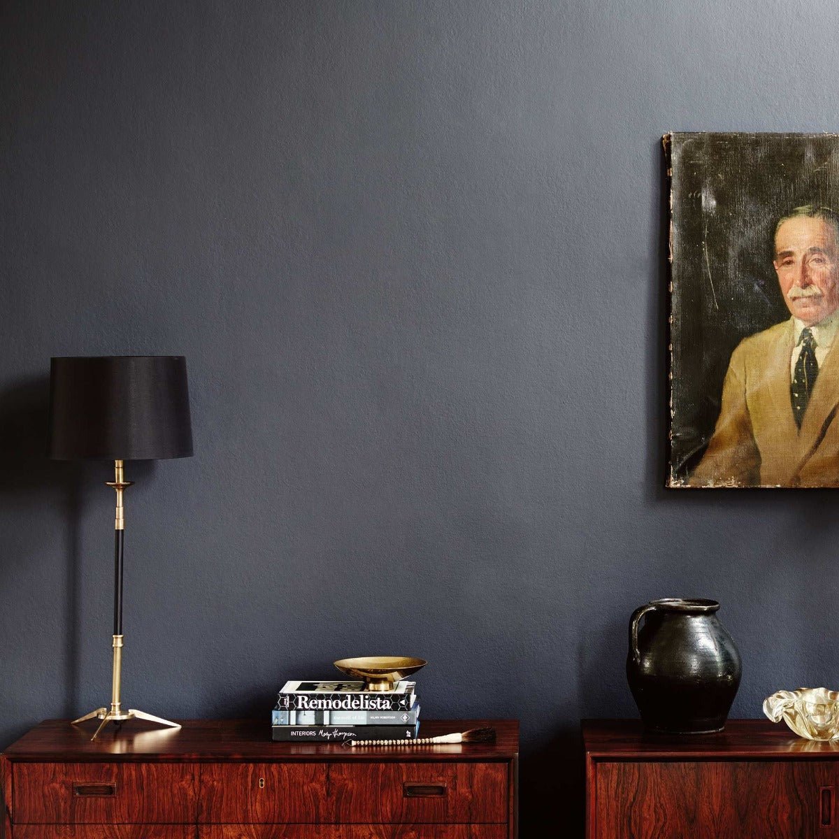
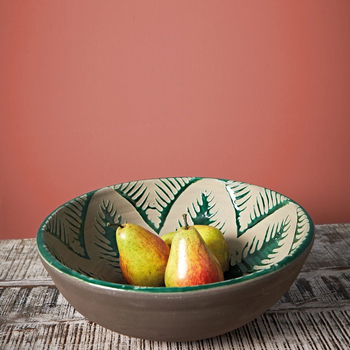
Statement paint can be used in virtually any room, as long as the shade is chosen to complement the light, scale and function of the space. In living rooms, bold colours such as deep blue, dark green or even burnt orange can create a rich and inviting atmosphere, especially when paired with layered lighting and textured finishes. Dining rooms are often overlooked, but they provide the perfect opportunity to explore darker or more vibrant tones that encourage conversation and intimacy. Bedrooms, too, benefit from deeper shades — particularly those with a cocooning feel like charcoal, aubergine or rich teal — offering a calming retreat that still feels luxurious.
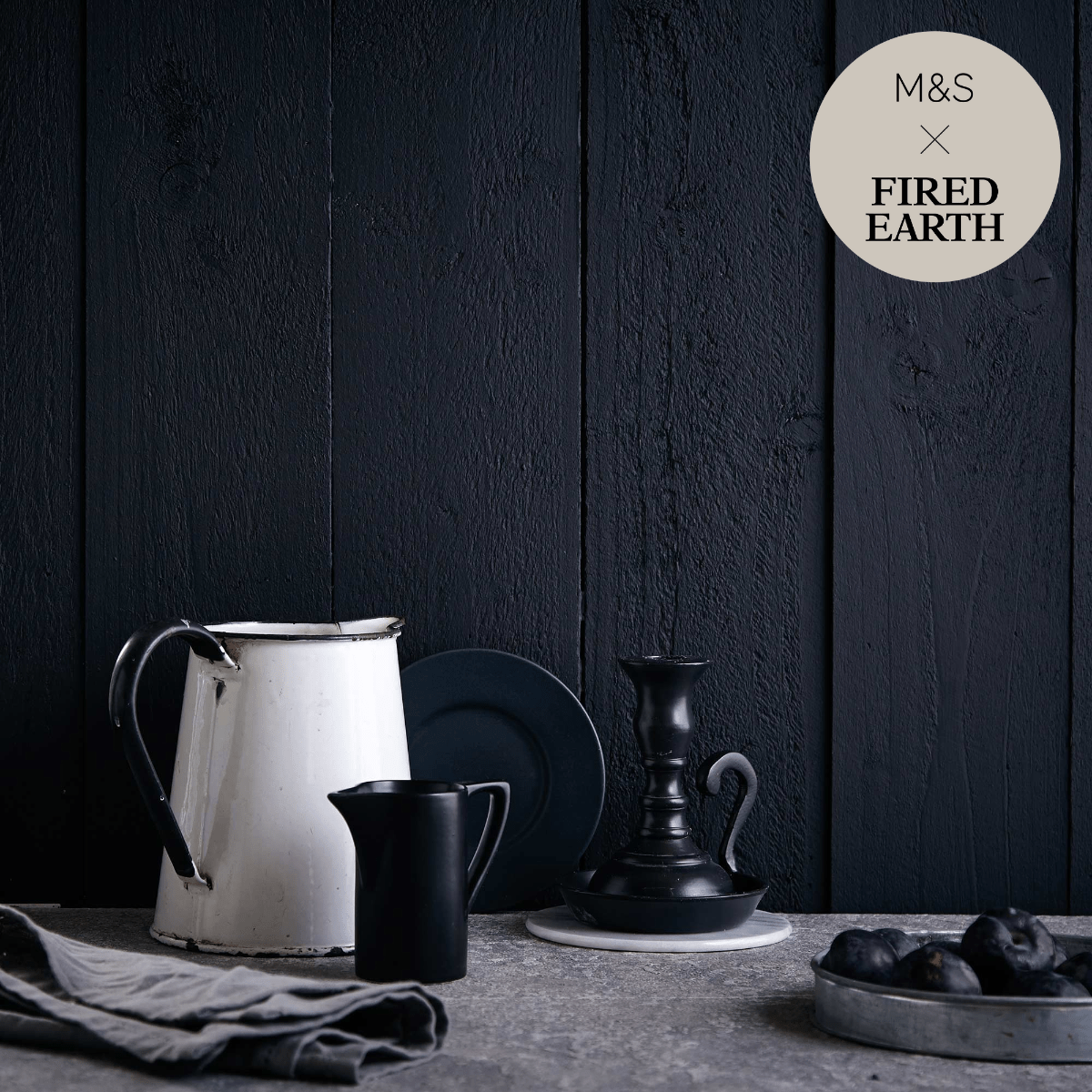
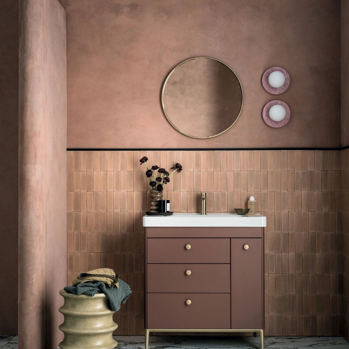
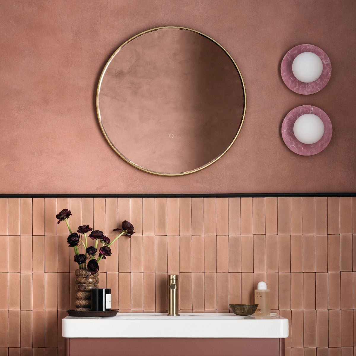
In kitchens, statement paint can be used on walls or cabinetry to create contrast against worktops and splashbacks. Forest green, navy and mustard are particularly effective in both classic and contemporary kitchen settings. Bathrooms are another ideal space for bold colour, where the small scale and enclosed walls create a sense of drama. Jewel tones and saturated shades add a spa-like or boutique hotel feel. Even transitional spaces like hallways or stairwells can benefit from a bold paint choice, giving an instant impression and connecting different areas of the home with confidence and style.
Balancing Statement Colours with the Rest of Your Interior
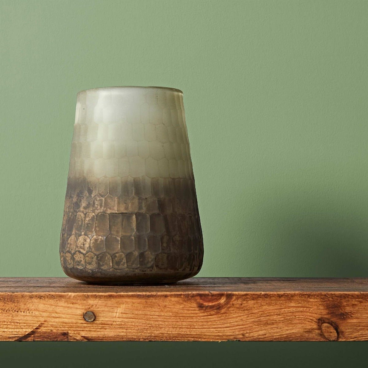
When using bold paint, balance is key. Statement hues work best when they’re offset by complementary tones and textures. This doesn’t mean everything else in the room needs to be neutral, but rather that the strong colour should be allowed to lead the scheme. For instance, a deep navy wall pairs well with warm metallics, soft grey upholstery and natural timber flooring. A rich olive or ochre shade can be paired with cream linens, rattan, or black iron fixtures to give it structure and softness. Even bold colours benefit from a sense of harmony.
You can also create tonal variation by layering different intensities of the same colour family. For example, a feature wall in deep green might be balanced with sage accessories and mid-toned furniture. This creates a sophisticated and cohesive look without the need for stark contrast. At Hyperion Tiles, our statement paint hues have been selected for their versatility, meaning they can be styled up or down depending on your taste. Whether you want your walls to do all the talking or act as a backdrop for your decor, we offer colours that work across a variety of styles and room types.
Statement Colour and Lighting
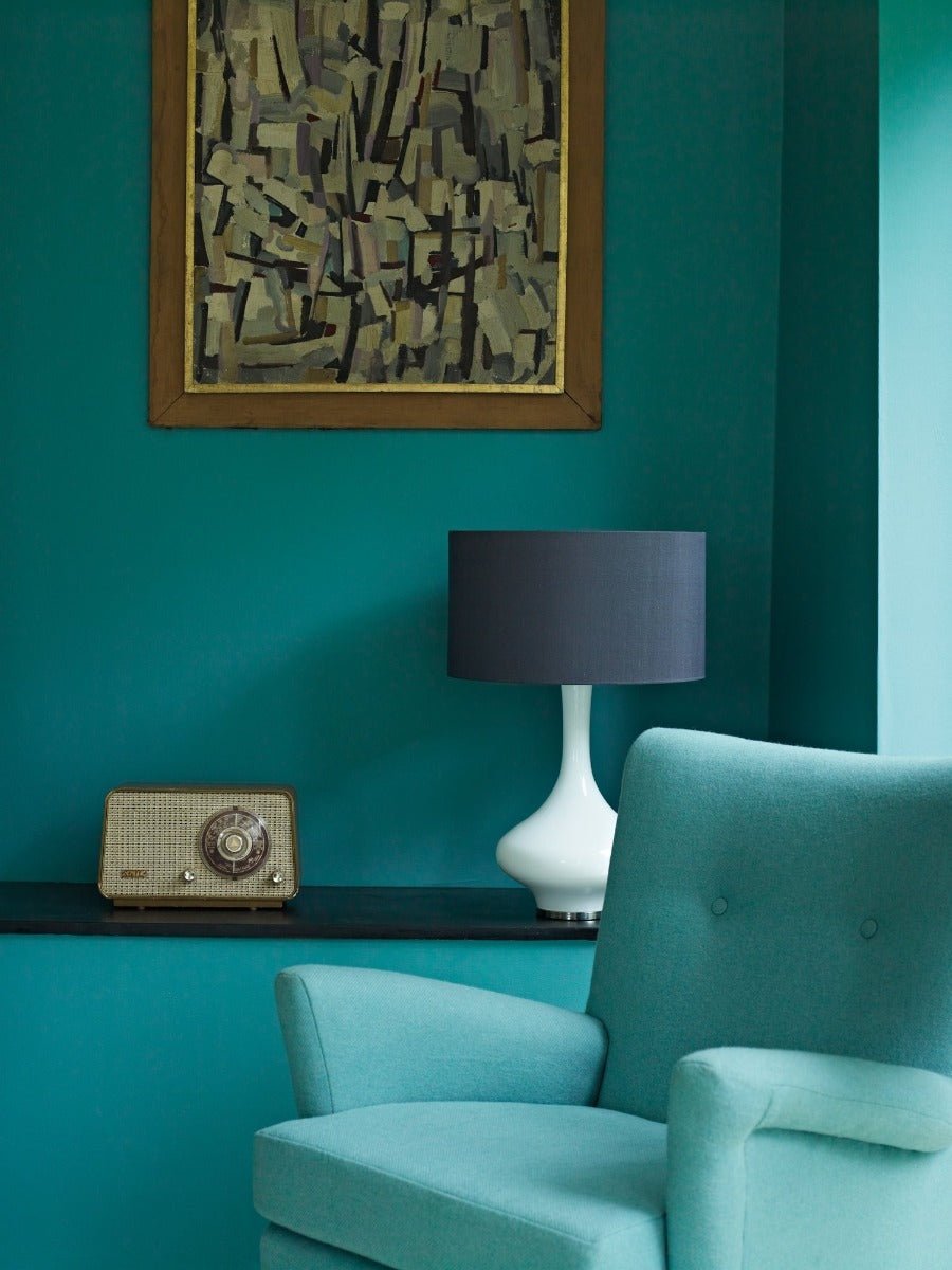
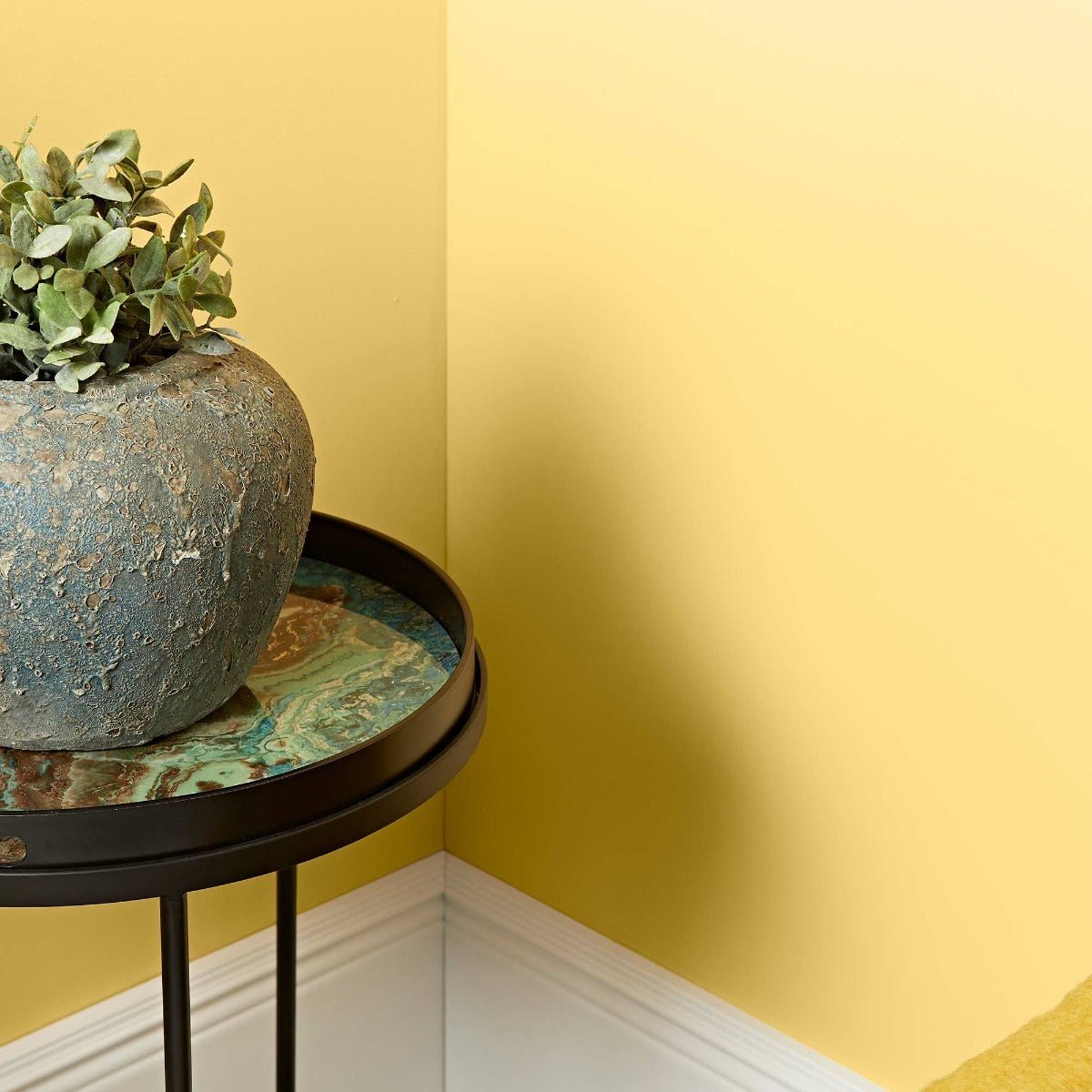
Lighting plays an essential role in how statement paint colours are perceived. Natural light will often enhance the richness and clarity of a bold colour, especially in south-facing rooms where the light is warm and golden. In low-light rooms, statement colours can take on a more dramatic, enveloping quality, which can be particularly effective in spaces where you want to relax, such as a bedroom or snug. In these settings, darker hues don’t necessarily make the space feel smaller — instead, they help blur boundaries and soften corners, creating a sense of intimacy.
Artificial lighting can also transform how a bold colour is experienced. Warm white light brings out the richness and depth of shades like aubergine or emerald, while cooler light might enhance the crispness of navy or slate. The finish you choose will also affect how the colour reflects or absorbs light. A matt finish tends to soften and deepen the colour, creating a velvety effect, while eggshell or satin adds a subtle sheen that makes the colour appear more vibrant. At Hyperion Tiles, we recommend sampling statement colours on different walls and observing how they shift under various light sources before committing to your final choice.
Statement Shades for Every Style
Contrary to what many believe, statement colours are not limited to contemporary or maximalist interiors. They work beautifully in all design styles when chosen thoughtfully. In period homes, colours such as burgundy, deep teal or graphite grey can highlight traditional features and work seamlessly with original details like cornicing, fireplaces or panelled doors. In mid-century interiors, mustard yellow, navy and olive green complement walnut woods and geometric forms. For modern or industrial spaces, bold tones provide much-needed warmth and contrast to materials like concrete, metal and glass.
Even in minimalist settings, a statement paint colour can create a strong visual anchor. A single wall in rust, petrol blue or oxblood red can be enough to bring focus to a simple space. When combined with layered textures and a cohesive palette, the result is clean, confident and characterful. At Hyperion Tiles, our approach to statement colour is rooted in design longevity. We don’t chase fleeting trends — instead, we focus on timeless shades that feel bold without being brash, and which will continue to look relevant as your space evolves over time.
Colour with Confidence at Hyperion Tiles
Statement paint is about creating a space that reflects your own vision and lifestyle. It allows you to take creative control and design rooms that tell a story, whether through a single striking shade or a combination of strong tones and materials. Choosing a bold colour doesn’t mean sacrificing comfort or elegance — in fact, when used thoughtfully, it can elevate your home and create a sense of cohesion, style and sophistication. These shades are for homeowners who aren’t afraid to express themselves, but who still want a space that feels calm, comfortable and beautifully designed.
At Hyperion Tiles, our statement paint range is made with premium pigments and carefully developed for both performance and aesthetic quality. Each shade has been tested for richness, coverage and versatility, so you can be confident that the colour you choose will look stunning on the wall and last beautifully over time. Whether you're looking to define a bold hallway, energise a living room or add depth to a bedroom, our collection offers something for every taste and layout.
Explore our full range of statement paint hues and experience the power of bold, beautiful colour with Hyperion Tiles.