
 Choosing the right tile colours can be a game changer for your home. In 2025, the trend is shifting towards immersive designs with bold emotional impacts. But here’s the twist—it’s not just about the tiles themselves. The grout colours you select can completely transform the finished look. This means that every choice, big or small, can redefine your space and influence the way you feel within it.
Table of Contents
- Understanding Your Room’s Purpose
- Popular Tile Colour Combinations
- How To Select Grout Colour
- Considering Tile Size And Shape
- Current Tile Colour Trends
Quick Summary
| Takeaway | Explanation |
|---|---|
| Understand Room Purpose | Tile colour selection should align with the emotional atmosphere and functionality of each room, utilising techniques like ‘colour drenching’ to create immersive environments. |
| Choose Complementary Combinations | Opt for colour schemes that feature harmonious pairings, such as jewel tones for bold statements or earthy neutrals for warmth, to elevate the overall aesthetic. |
| Grout Matters | Selecting the right grout colour can enhance tile design—matching for a seamless look or contrasting for visual impact—while considering practical durability based on the room’s traffic. |
| Consider Size and Shape | Large-format tiles can create a sense of space in smaller rooms, and dynamic tile patterns, like herringbone or hexagonal, can transform ordinary surfaces into eye-catching design features. |
| Stay Updated on Trends | Neutral palettes with bold accents, natural stone inspirations, and innovations in tile technology reflect current design philosophies, allowing for contemporary yet timeless spaces. |
Understanding Your Room’s Purpose
Choosing tile colours isn’t just about aesthetic appeal—it’s a strategic decision that transforms spaces by aligning design with functional requirements. Every room tells a unique story, and the tiles you select become a crucial narrative element that reflects both purpose and personality.
Decoding Room Functionality and Emotional Atmosphere
Each room in your home serves a distinct purpose, which directly influences your tile coloUr selection strategy. Living spaces demand different emotional responses compared to utilitarian areas like kitchens and bathrooms. For instance, a home office requires concentration-enhancing coloUrs, while a kitchen might benefit from energetic, vibrant tile selections.
The contemporary design philosophy emphasises what experts call ‘colour drenching’—a technique where a single bold tile colour dominates the entire space. Research from Ramirro Tiles suggests this approach creates immersive environments that dramatically influence mood and spatial perception.
Spatial Dynamics and Tile Size Considerations
Tile size plays a significant role in understanding room purpose. Large-format tiles, measuring up to 1.5 x 3 metres, are increasingly popular in UK interior design. Hyperion Tiles research indicates these expansive tiles create seamless, uncluttered surfaces that make rooms appear larger—a critical consideration for smaller spaces like bathrooms and compact kitchens.
For living rooms, consider matte, large-format tiles that provide depth without visual complexity. Kitchens might benefit from bold, patterned tiles that inject energy, while bathrooms could leverage vertical tile placements to enhance perceived height and create a spa-like atmosphere.
Psychological Impact of Colour Selection
Beyond aesthetics, tile colours profoundly impact psychological well-being. Cool blues and greens can create calming environments ideal for bedrooms and home offices, promoting relaxation and focus. Warm terracotta or soft neutrals can make living spaces feel inviting and comfortable.
Understanding your room’s purpose means recognising how colour interacts with light, space, and human emotion. A carefully chosen tile colour doesn’t just decorate a room—it transforms how people experience and interact with that environment. By considering functionality, spatial dynamics, and psychological nuances, you’ll make tile color choices that are both visually stunning and purposefully intelligent.
Popular Tile Colour Combinations
Choosing tile colours transcends individual selections—it’s about creating harmonious palettes that transform spaces with visual sophistication and emotional resonance. The art of combining tile colours requires understanding colour theory, spatial dynamics, and contemporary design trends.
Jewel-Toned Elegance and Bold Contrasts
For 2025, interior design is embracing bold, rich colour palettes that make powerful statements. HE Smith’s design research highlights emerging trends featuring jewel-like hues such as emerald greens, sapphire blues, and deep reds. These intense colours create stunning feature walls that instantly elevate a room’s aesthetic.
Emerging colour combinations include complementary and analogous schemes. Consider pairing deep teal with soft sage green, or combining sapphire blue with rich indigo for a sophisticated, layered look. These combinations work exceptionally well in bathrooms, kitchens, and accent spaces where visual drama is desired.
Earthy Neutrals and Warm Tones
Pantone’s colour insights suggest ‘Mocha Mousse’ as a pivotal tile colour for 2025, representing a shift towards sophisticated, nuanced neutrals. Earthy toned tiles in pinkish brown hues and terracotta with brown undertones are becoming increasingly popular, offering warmth and versatility.
Ideal combinations include pairing warm terracotta tiles with soft cream or light grey tiles, creating a balanced, inviting atmosphere. These colour pairings work wonderfully in living spaces, providing a sense of groundedness and connection to natural materials. 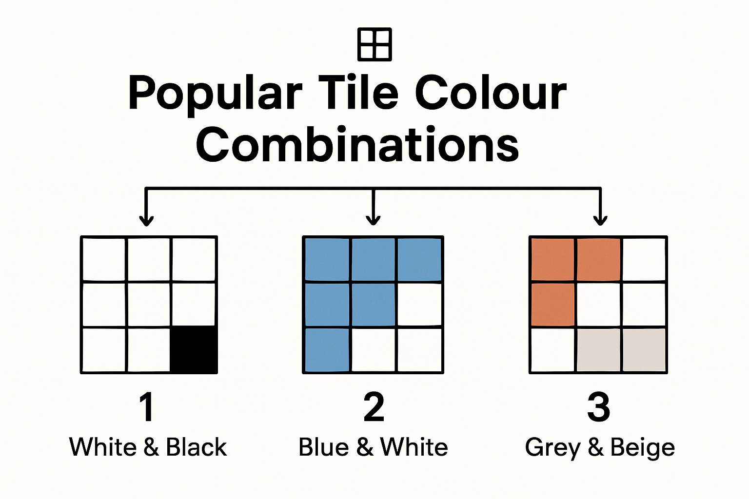
Practical Luxury: High Contrast and Functional Design
Ramirro Tiles’ latest research reveals an innovative trend of combining glossy and anti-slip tiles. This approach not only ensures safety in wet areas but also introduces a luxurious design element. Imagine pairing sleek, high-gloss white tiles with textured, matte grey tiles in a bathroom or kitchen—creating visual interest while maintaining practical functionality. 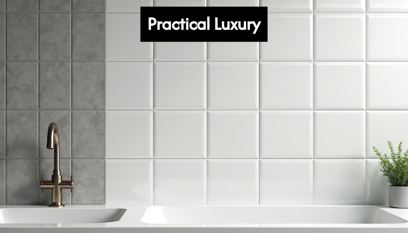 The key to successful tile colour combinations lies in balance. Avoid overwhelming spaces with too many competing colours. Instead, choose a dominant colour and use accent tiles to create depth and intrigue. Whether you’re aiming for bold statement designs or subtle, sophisticated palettes, thoughtful colour selection can transform ordinary spaces into extraordinary environments.
How to Select Grout Colour
Grout might seem like a minor detail in tile design, but it plays a crucial role in defining the overall aesthetic and functionality of your tiled surfaces. Choosing the right grout colour can dramatically transform the visual impact of your tiles, affecting both style and practicality.
Aesthetic Strategies for Grout Colour Selection
European Heritage Tile Experts highlight two primary design approaches for grout colour: seamless matching and intentional contrast. Matching grout creates a uniform, fluid look where tile patterns blend smoothly, ideal for minimalist and contemporary spaces. Conversely, contrasting grout colours can dramatically highlight tile shapes, creating visual intrigue and defining individual tile edges.
For instance, white tiles paired with white grout offer a clean, expansive appearance, while the same tiles with dark grey or black grout can create a bold, graphic statement. The choice depends on your design goals and the room’s overall aesthetic vision.
Practical Considerations and Traffic Dynamics
Cavastone’s tile research recommends strategic grout colour selection based on practical usage. High-traffic areas benefit from darker grout shades that effectively conceal dirt and wear. This approach is particularly valuable for wood-look tiles or areas prone to frequent use, such as kitchen floors, hallways, and entryways.
Consider the room’s function when selecting grout colour. Lighter, more delicate grout works beautifully in low-traffic areas like bathrooms or feature walls, while robust, darker grout provides longevity in busy household zones. The goal is to balance aesthetic preferences with realistic maintenance requirements.
Trending Tile and Grout Combinations
Tile Giant’s comprehensive guide reveals contemporary colour pairings that elevate tile design. Popular combinations include white tiles with white, light grey, or black grout for clean or high-contrast looks. Grey tiles work wonderfully with light to charcoal grout, creating depth and sophistication.
Marble-effect tiles shine when paired with light grey, silver, or off-white grout, delivering a refined, luxurious finish. These strategic colour selections transform grout from a mere functional element to an integral design feature that enhances tile beauty.
Remember, grout colour is not just about aesthetics—it’s about creating a cohesive, practical design that reflects your personal style and meets the specific demands of each space. Take time to explore samples, consider lighting, and visualise how different grout colours interact with your chosen tiles.
Considering Tile Size and Shape
Tile size and shape are not merely aesthetic choices—they are powerful design tools that can dramatically transform spatial perception, create visual intrigue, and influence the overall atmosphere of a room. Understanding how different tile dimensions and configurations interact with your space is crucial for achieving a harmonious and visually compelling design.
Spatial Expansion Through Tile Dimensions
Hyperion Tiles research reveals that larger tile sizes can visually expand small rooms by reducing grout lines and minimising visual clutter. Large-format tiles, measuring up to 1.5 x 3 metres, create a seamless, contemporary look that makes spaces feel more open and sophisticated.
For compact areas like bathrooms or narrow hallways, consider using oversized tiles placed strategically to create an illusion of increased space. Rectangular tiles laid in a horizontal pattern can make a room appear wider, while vertical placement can enhance perceived height.
Geometric Patterns and Visual Dynamics
The arrangement of tiles is as important as their size. UK Design Trends for 2025 emphasise the importance of selecting tile sizes and shapes proportionate to room dimensions to achieve visual harmony.
Innovative layouts like herringbone, staggered, or vertical stacked patterns can introduce dynamic visual interest. A herringbone pattern with rectangular tiles, for instance, can draw the eye along specific lines, creating a sense of movement and transforming an ordinary surface into a design statement. Hexagonal tiles offer another contemporary option, breaking away from traditional rectangular configurations and adding geometric complexity.
Practical Considerations and Room-Specific Strategies
Each room demands a unique approach to tile sizing and shape. Kitchen splashbacks might benefit from smaller, intricate tiles that allow for detailed patterns, while living room floors could utilise large-format tiles for a clean, expansive feel. Bathrooms present an opportunity to experiment with mixed tile sizes, perhaps combining large floor tiles with smaller decorative wall tiles.
Consider the room’s lighting, furniture placement, and overall architectural character when selecting tile dimensions. Darker or smaller rooms might require lighter-coloured, larger tiles to create a sense of openness, while well-lit spaces can accommodate more complex, smaller tile designs.
Remember that tile size and shape are not just about visual appeal—they’re about creating a harmonious environment that reflects your personal style while maximising the potential of your space. Take time to explore different options, visualise potential layouts, and don’t be afraid to experiment with unconventional tile configurations that challenge traditional design norms.
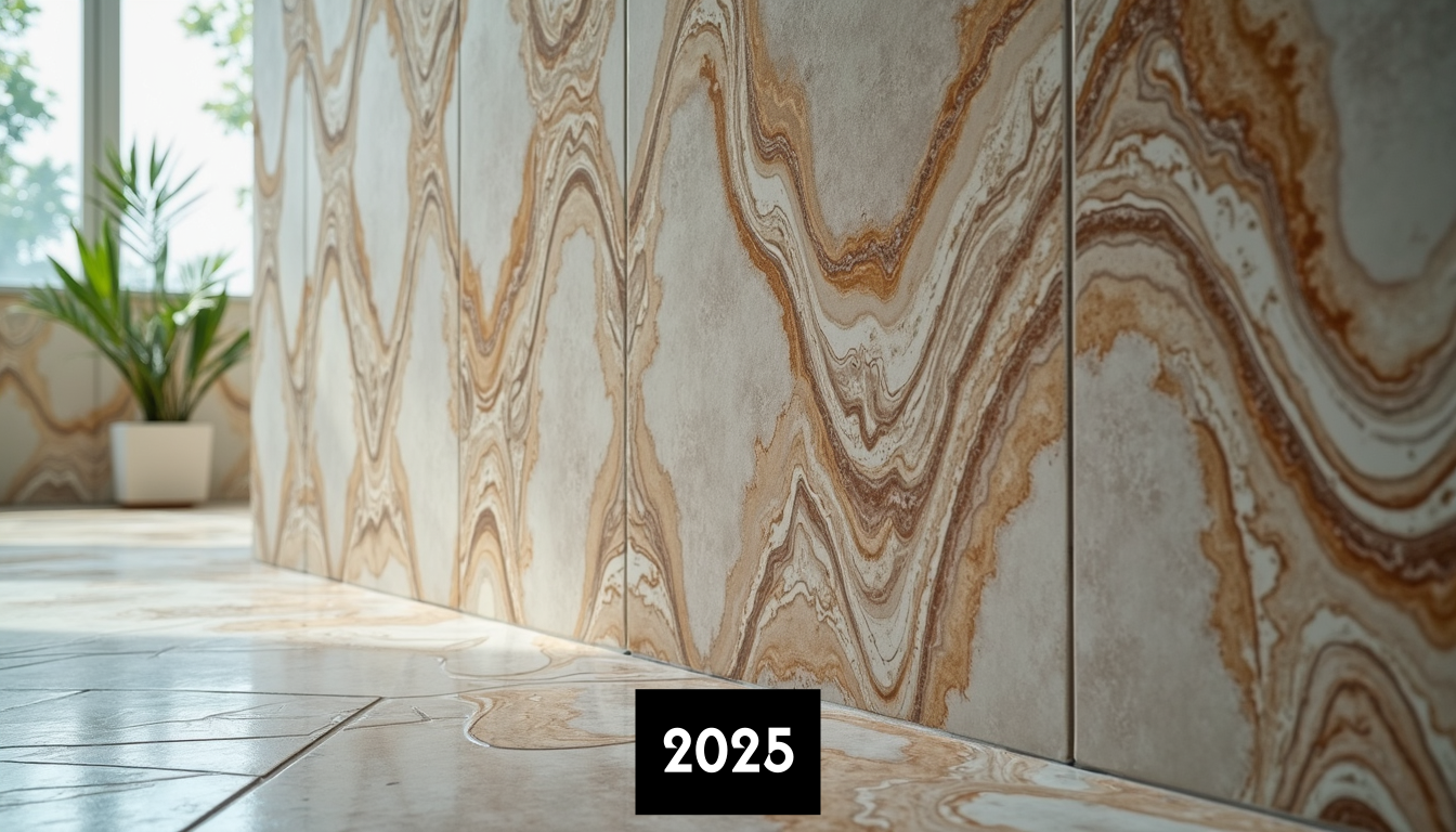
Current Tile Colour Trends
Tile colour trends represent more than mere aesthetic preferences—they reflect broader cultural shifts, technological innovations, and evolving design philosophies. Understanding these trends enables homeowners and designers to create spaces that feel contemporary yet timeless.
Neutral Foundations with Bold Accents
Low Carbon Buildings’ design analysis highlights a sophisticated approach to colour selection in 2025. Neutral palettes continue to dominate, providing versatile backdrops that allow strategic colour injections through accent tiles and bold design elements.
Contemporary neutral tones extend beyond traditional white and grey, embracing warm beiges, soft mushroom, and sophisticated taupe. These colours create calm, adaptable environments while offering subtle depth and complexity. Bold accent colours like terracotta red and sage green are being strategically incorporated to introduce personality and energy.
Natural Stone And Organic Colour Inspirations
Druston’s UK Tile Trends Report reveals a strong movement towards natural stone-inspired tile colours. Homeowners are gravitating towards earthy tones that reflect organic landscapes—think warm terracottas, muted greens, soft browns, and sophisticated grey-blues that mimic natural mineral formations.
These organic colour palettes offer more than visual appeal; they create a sense of connection with natural environments. Tiles featuring intricate veining and subtle colour variations simulate the complexity of marble, slate, and limestone, bringing a tactile, authentic quality to interior spaces.
Technological Innovations in Colour Technology
Modern tile manufacturing techniques now allow for unprecedented colour precision and durability. Digital printing technologies enable incredibly realistic colour reproductions, allowing tiles to mimic materials like wood, concrete, and natural stone with remarkable accuracy.
Emerging trends include gradient tiles that subtly transition between complementary colours, creating visual intrigue without overwhelming spaces. Metallic undertones and iridescent finishes are also gaining popularity, offering dynamic colour experiences that change subtly with lighting conditions.
Choosing tile colours in 2025 is about creating narrative spaces that reflect personal style while remaining adaptable to changing design preferences. By understanding current trends and selecting colours thoughtfully, you can transform tiles from mere surface coverings into sophisticated design statements that elevate your entire living environment.
Frequently Asked Questions
What tile colours are trending in 2025?
Current trends in 2025 include bold jewel tones, earthy neutrals, and organic colour inspirations that mimic natural stone. Popular combinations feature warm terracotta, soft beige, and deep emerald hues.
How do I choose the right grout colour?
When selecting grout colour, consider matching it to your tiles for a seamless look, or contrasting it to highlight tile shapes. Choose darker grout for high-traffic areas to mask dirt, while lighter grout works well in low-traffic spaces.
What factors should I consider when choosing tile sizes?
When selecting tile sizes, consider the dimensions of the room. Large-format tiles create an open feel in compact spaces, while smaller tiles allow for intricate patterns. Also, take into account lighting and furniture placement to enhance the overall design.
How can tile colours affect the atmosphere of a room?
Tile colours can significantly impact the emotional atmosphere of a room. Cool colours like blue and green promote calmness, while warm colours like red and terracotta create inviting and energising spaces. Understanding the room’s purpose aids in making effective choices.
Elevate Your Space with Perfect Tile Combinations!
Choosing the right tile colours can seem daunting, especially with so many options that promise to transform your home’s atmosphere. As discussed in our guide, the psychological impact of colour and the art of colour drenching can dramatically enhance your environment. Whether you’re aiming for bold elegance or inviting warmth, understanding your room’s purpose is key!
Let us take the guesswork out of your tile selection. At Hyperion Tiles, we offer a vast collection tailored to every need: from kitchens to bathrooms, and floor tiles to wall mosaics. Enjoy promotions and the ease of shopping for the latest trends like jewel-toned elegance or earthy neutrals. Our user-friendly interface makes finding the perfect pieces a breeze, and with free shipping on orders over a certain amount, there’s never been a better time to refresh your spaces!
So, are you ready to transform your home with stunning tiles that align with the latest trends? Visit us now at Hyperion Tiles and take advantage of our curated collections and price matching to get the best deals available. Don’t wait—your dream space is just a click away!
Share:
How to choose green tiles for your bathroom